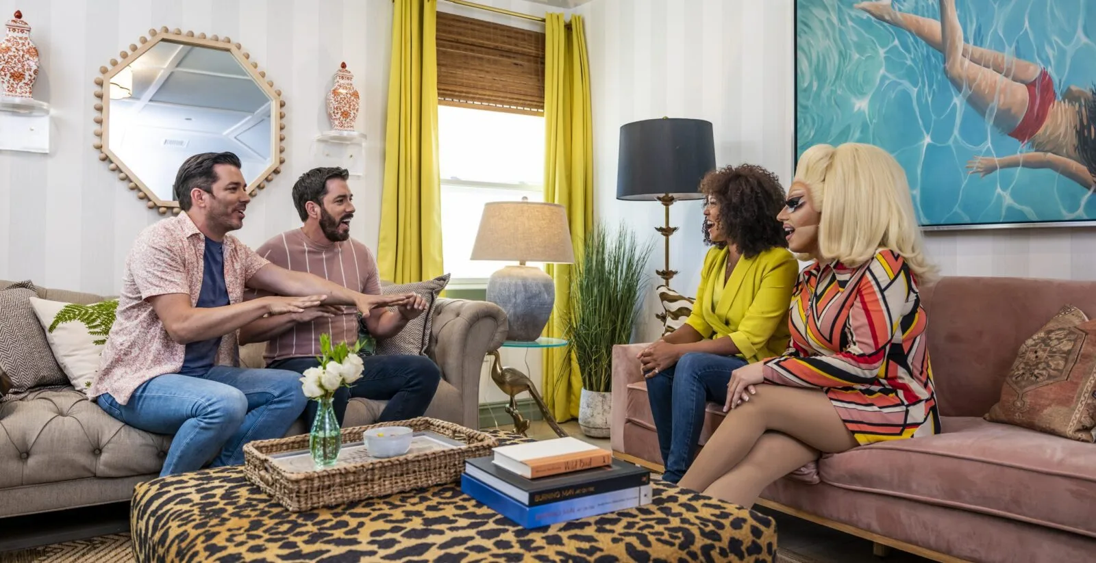
Hello, San Francisco! This season, we landed in one of the hottest real estate markets in the country. We reinstated the traditional Brother vs. Brother rules: We each buy, renovate, and sell a property, and the brother with the biggest net profit wins, with all proceeds going to charity. This time around, we added an extra layer to our brotherly competition. Because houses sell so quickly in the Bay Area, we bought ours online, sight unseen—unprecedented craziness for Brother vs. Brother!
For our third challenge of Season 6, we renovated our respective master suites: bedroom, bathroom, and closets. Read on to learn about our inspiration and the design details we’re particularly proud of.
Shop the Look
Check out the decor, furniture, and more seen in this episode–and get it for yourself!
BVB S6E4
Click here to see all of the items featured in this episode!
Drew’s Canyon House
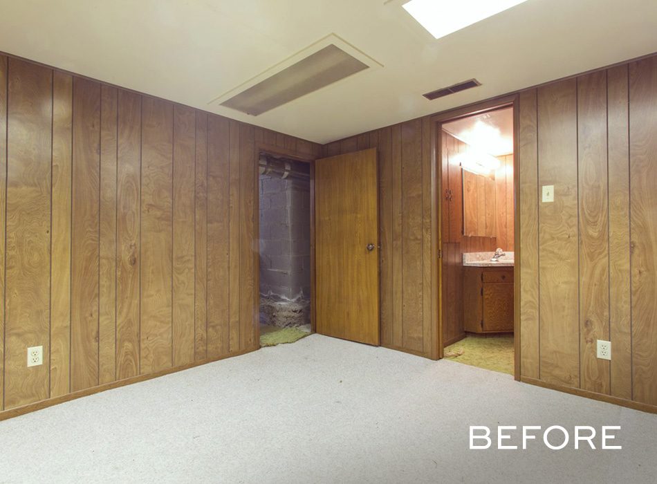
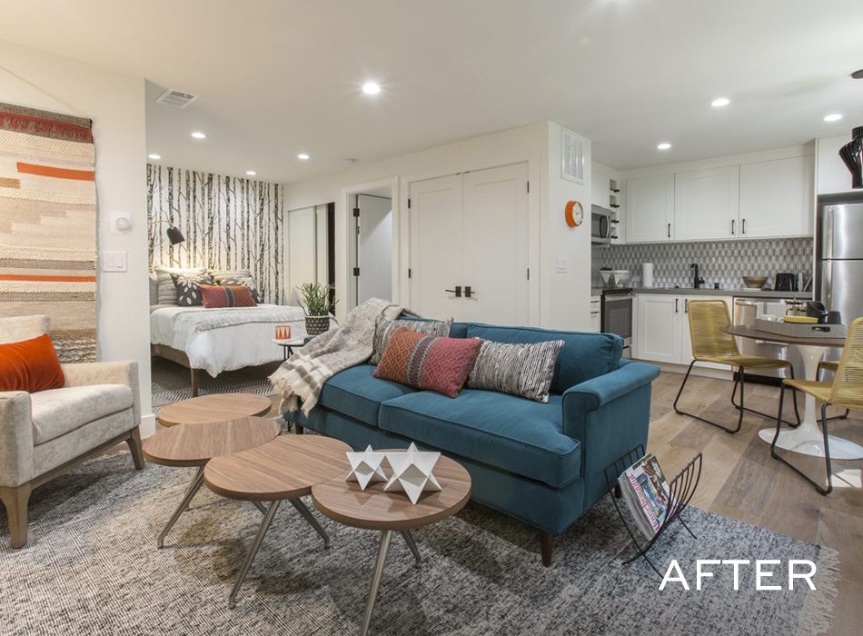
For my bonus space, I made it a real bonus: bonus cash, that is, because we turned an illegal bedroom into a legal rental suite. In San Francisco, the country’s most expensive place to live, that’s a game-changer. I got to work putting in, well, everything—and taking out a whole bunch of dirt to get down far enough to install a full suite.
Drew’s Inspiration
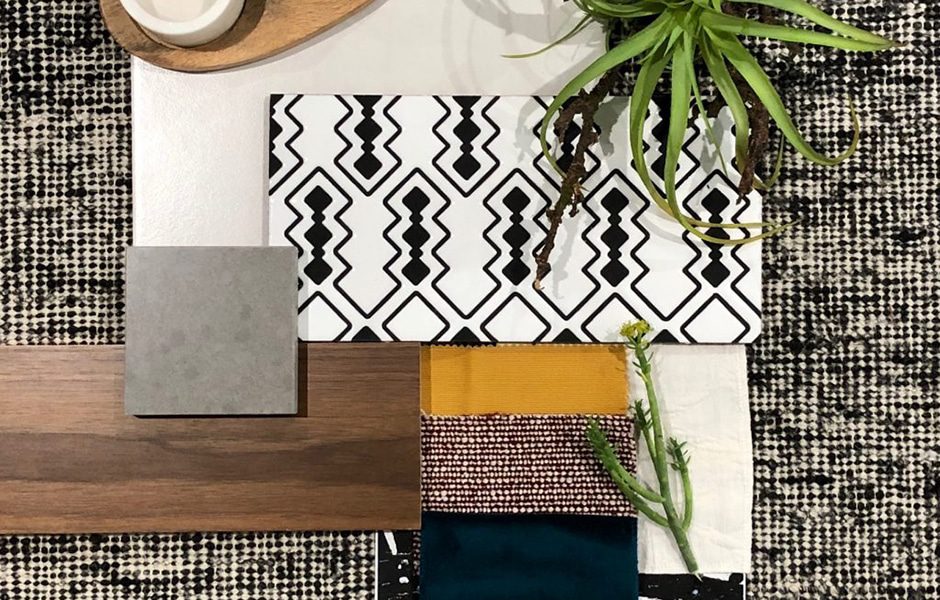
California-cool • Light • Open • Modern • Stylish • “Un-basement-like”
Drew’s Design Highlights
I’M TEAL-ING YOU…
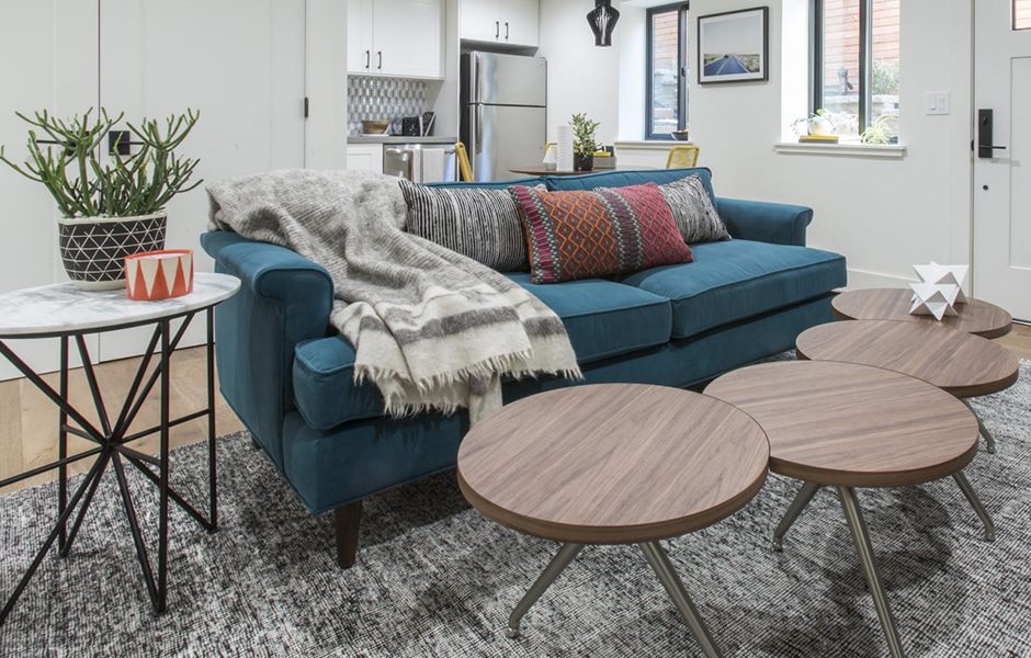
I’m so in love with the deep teal couch in the guest suite of my Honeymoon House in Los Angeles that I wanted to re-create it here. The one we found on Wayfair is slightly smaller and a touch more casual—but just as stunning. Plus, the jewel tone is a nod to the main entrance wallpaper upstairs and the tile in the master bathroom!
PARQUET EXCELLENCE
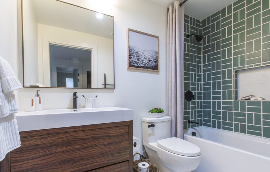
Meet the bathroom’s showcase feature: blue-green shower tile in an intricate parquet pattern, set off by a crisp, thick grout line. The whole thing brings visual interest and brightness into this tight space.
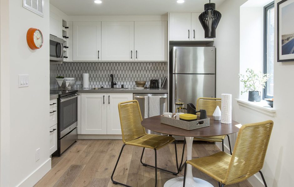
APPLIANCE COMPLIANCE
I was insistent on putting full-size appliances (range, microwave, dishwasher, refrigerator) in the rental space. Not only does the extra stainless-steel surface area simply look great, but now any renters will feel truly at home.
Team Drew
Local construction support: Jason Bliss and Scott Bliss of Benchmark Construction
Local design support: Laura Martin Bovard of LMB Interiors
Interior and closet doors: Meeks
Windows and doors: Dolan’s Lumber
Kitchen cabinets: IKEA
Kitchen appliances: Friedmans Appliance
Backsplash and shower tile: Fireclay Tile
Bathroom floor tile: Tile Shop
Mattress: Scott Living by Restonic
Jonathan’s Hilltop House
I’m adding value and accessibility everywhere you turn in this house. Most notably, I created an airy fifth bedroom out of the dungeon-like room downstairs (a true bonus space—it wasn’t even on the listing!) and upgraded the loft off the garage to a legal bedroom that serves as a private getaway with a view. Of course, I’m still thinking eco-chic: Brand-new windows and a tankless hot water heater reduce energy costs and maximize efficiency throughout the house.
Jonathan’s Inspiration
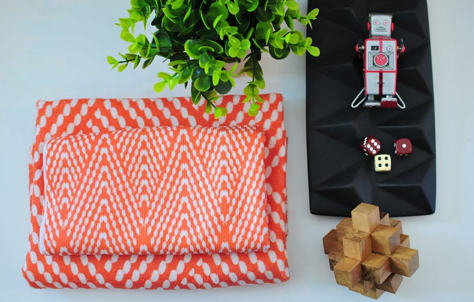
Light • Warm • Accessible • Modern • Spacious • Eco-chic • Clean
Jonathan’s Design Highlights
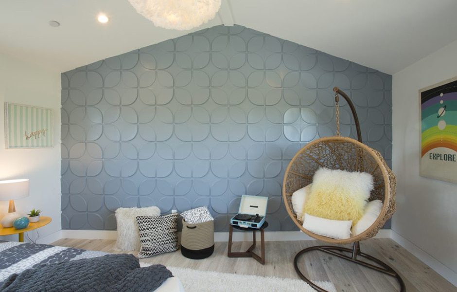
A LOFTY IDEA
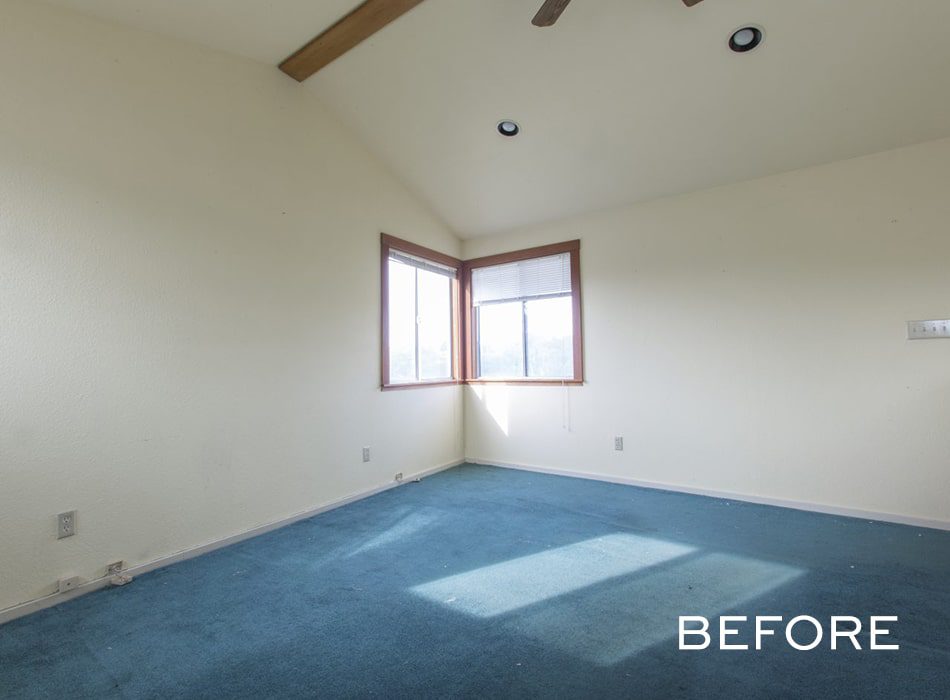
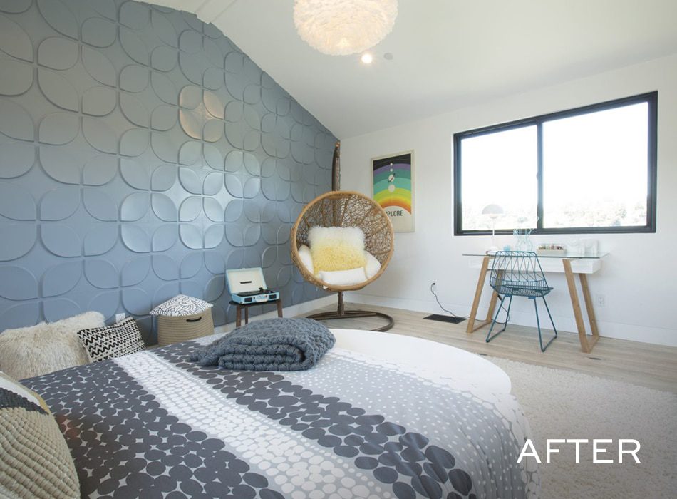
Accent walls don’t always have to be done with tile or wallpaper. I took an eco-chic chance on these decorative 3D acoustic panels made of bamboo fiber, which I painted a blueish-gray and then applied with contact cement. The resulting statement wall provides texture and color in addition to showing off the room’s sky-high ceiling.
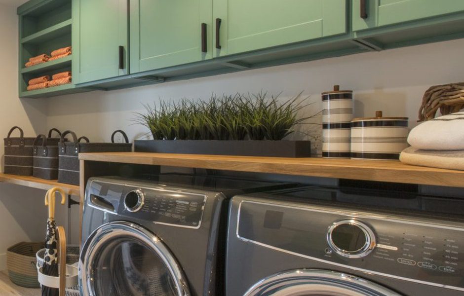
MOVERS AND SHAKERS
Buying furniture secondhand is better for your budget and the environment. At Habitat for Humanity’s ReStore, I found these shaker-style cabinets that fit perfectly in the laundry room. All it took to make them look custom was a quick sanding and stylish paint job. I rounded out the area with an affordable butcher-block countertop, and now it’s a place where you can feel fancy while washing and folding your underwear.
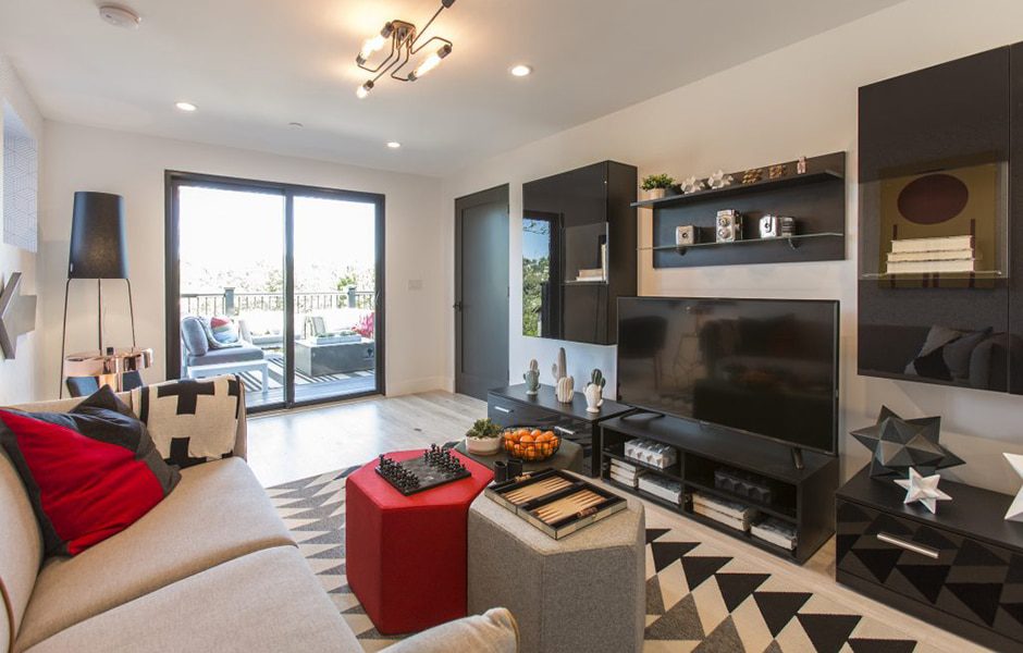
CONSOLE-ATION PRIZE
This room … ugh. Calling its original iteration a dark, creepy lair is being generous. After a complete gut job, it’s now all fun and games—literally—thanks to a sleek entertainment center and creative decor. We staged it as a laid-back game room where the family can watch movies and chill out, but it can actually be listed as yet another bedroom because we installed a closet.
Team Jonathan
Local construction support: Bob McLaughlin of McLaughlin Renovations
Local design support: Pamela Lin of Urbanism Designs
Washer and dryer: Friedmans Appliance
Mattress: Scott Living by Restonic
Door hardware: Belmont Hardware
Windows and interior doors: Economy Lumber
