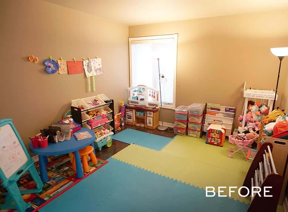
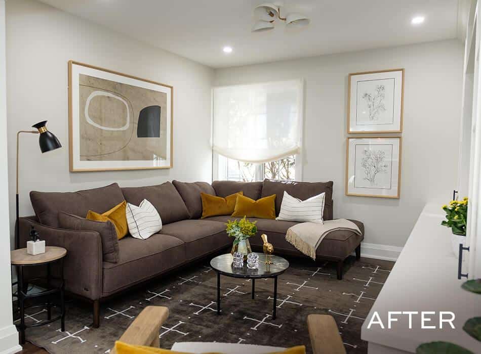
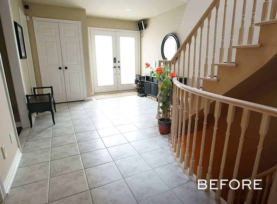
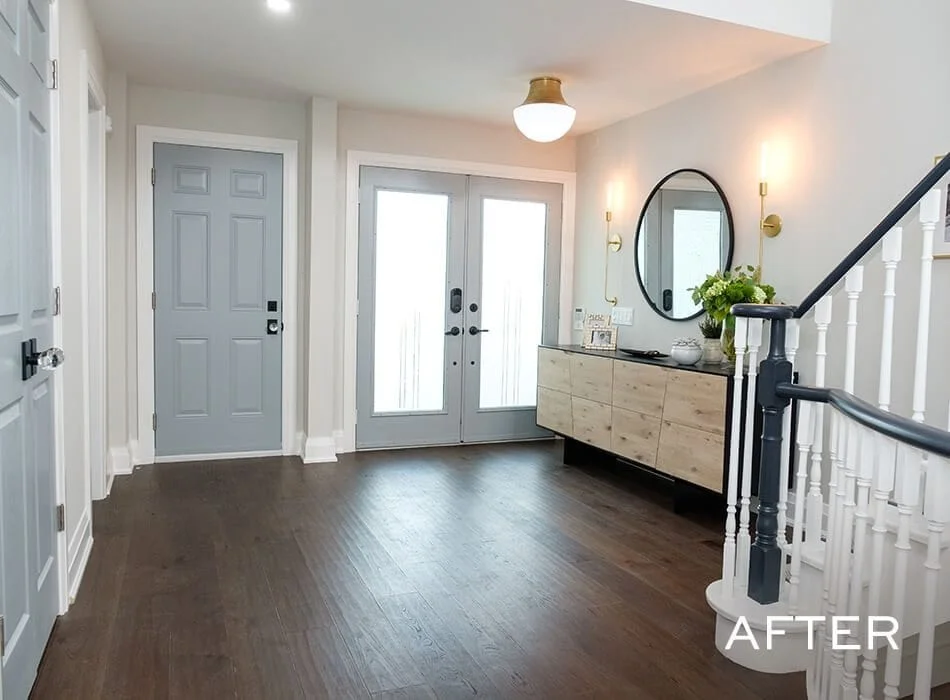
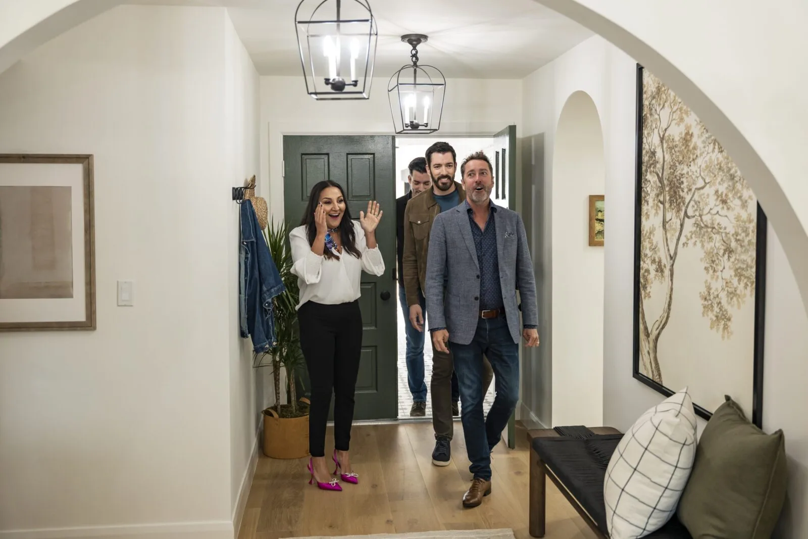
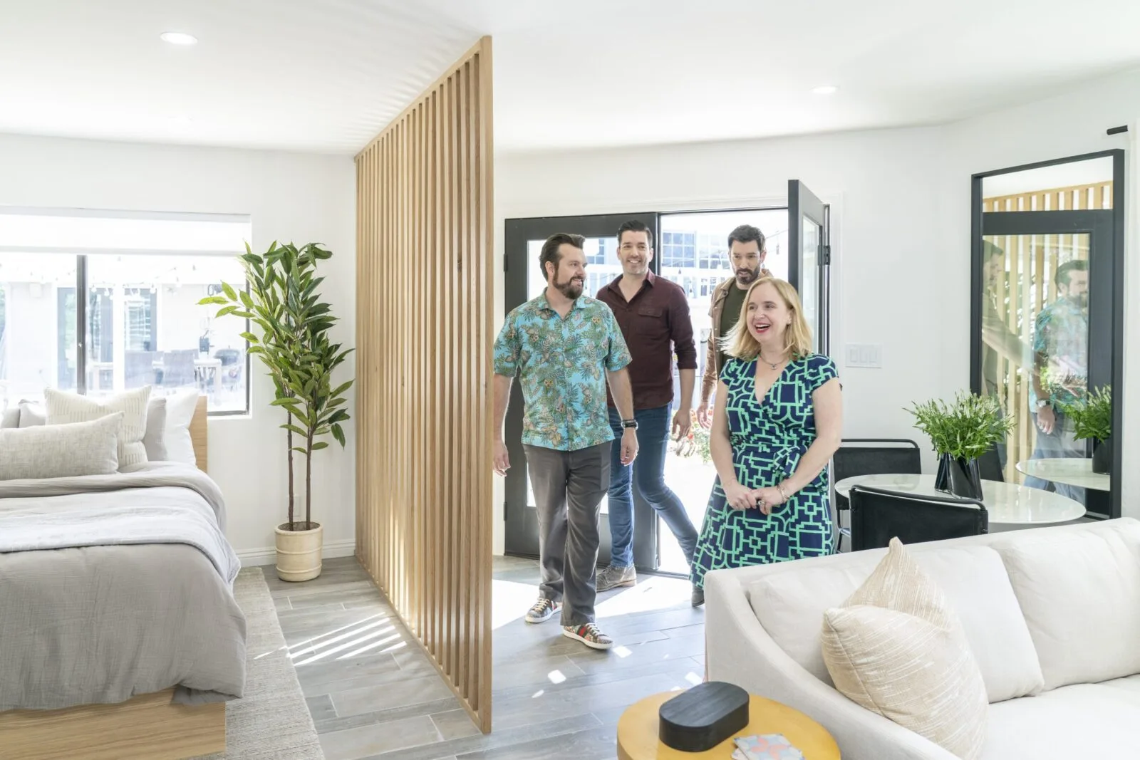
Michelle and Ghopi’s forever home is the center of attention for their friends and family. It’s a place where everyone gathers to catch up, have fun and even dance a little. Seven years and one adorable daughter later, their home’s builder-basic materials and layout have fallen behind the times. We came in to help reimagine their space so they could keep the good times rolling while enjoying the everyday pleasures of a home that works for them.
Shop the Look
Check out the decor, furniture, and more seen in this episode–and get it for yourself!
FHS02E10 Michelle Ghopi
Click below to see all of the items featured in this episode!
| wdt_ID | Room | Product Type | STYLE | Product | Company | Product Code/Sku |
|---|---|---|---|---|---|---|
| 1 | Main Floor | Flooring | Cordoba | Cordoba | CRAFT Artisan Wood Floors | N/A |
| 2 | Main Floor | Door Hardware | Bristol Knob – Modern | Bristol Knob – Modern | Emtek | N/A |
| 3 | Main Floor | Pot Lights | HLB4LED | HLB4LED | HALO | HLB4 LED |
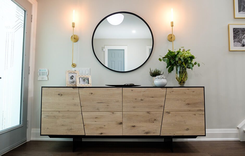
| 4 | Entry | Lighting | Mitzi Dylan Aged Brass Sconce | Mitzi Dylan Aged Brass Sconce | Lights Canada | H185101-AGB |
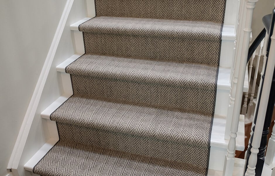
| 5 | Entry | Staircase Runner | Staircase Rug | Staircase Rug | Allan Rugs | N/A |
| 6 | Entry | Lighting | Hudson Valley Lettie Aged Brass Flush Mount | Hudson Valley Lettie Aged Brass Flush Mount | Lights Canada | 9415-AGB |
| 7 | Powder Room | Vanity | Jessica | Jessica | Valley Acrylic | VA03WHT |
| 8 | Powder Room | Toilet | Dual Flush Siphonic Water Toilet | Dual Flush Siphonic Water Toilet | Valley Acrylic | VA0076 |
| 9 | Powder Room | Faucet | Soigne Series | Soigne Series | Valley Acrylic | 802.211.100 |
| 10 | Powder Room | Towel Ring | Towel Ring | Towel Ring | Valley Acrylic | 118.007.100 |
DESIGN HIGHLIGHTS
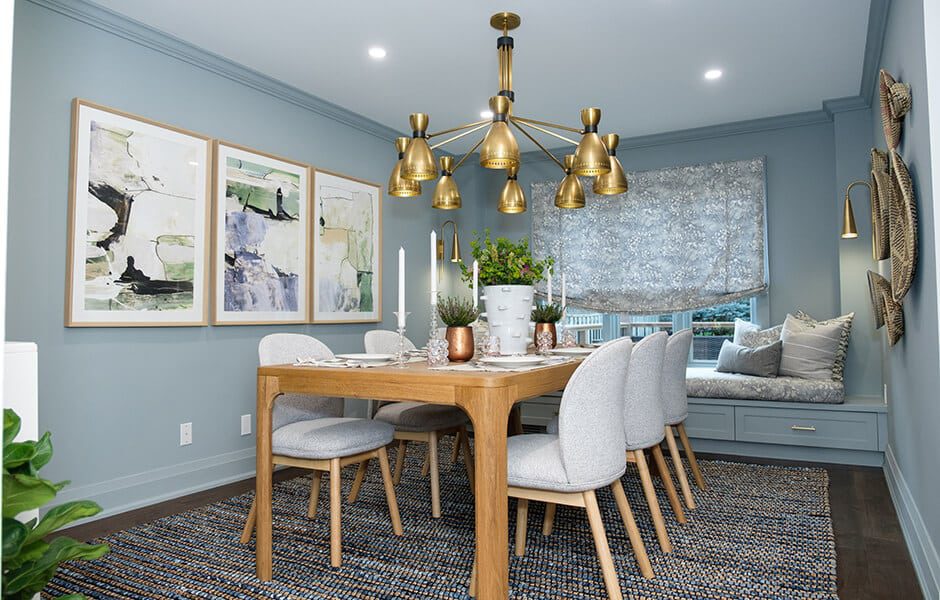
TAKE A SEAT (PLEASE!)
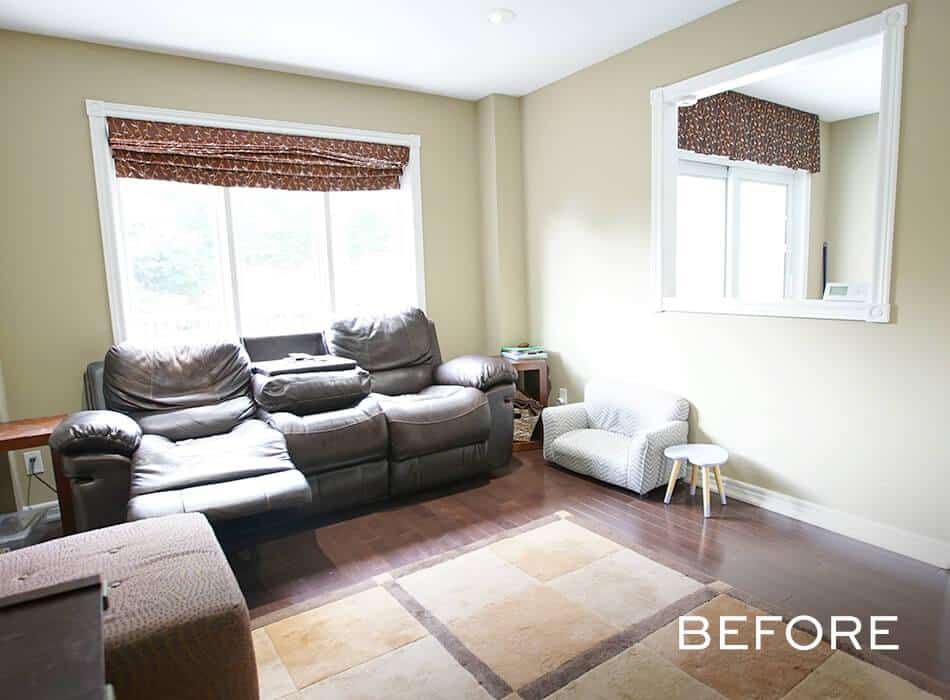
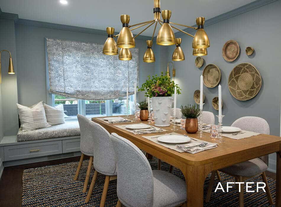
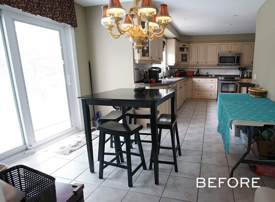
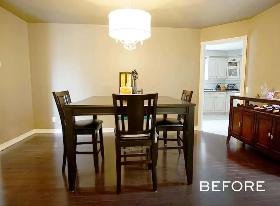
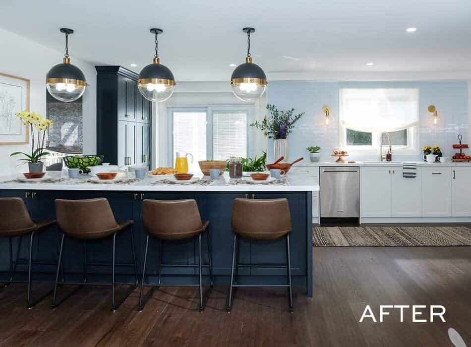
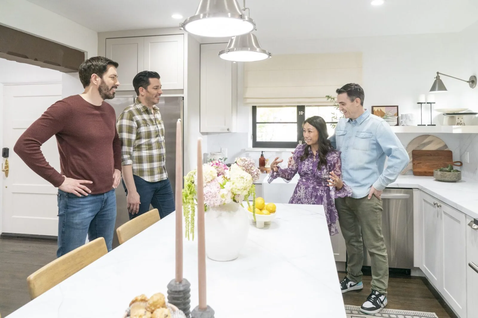
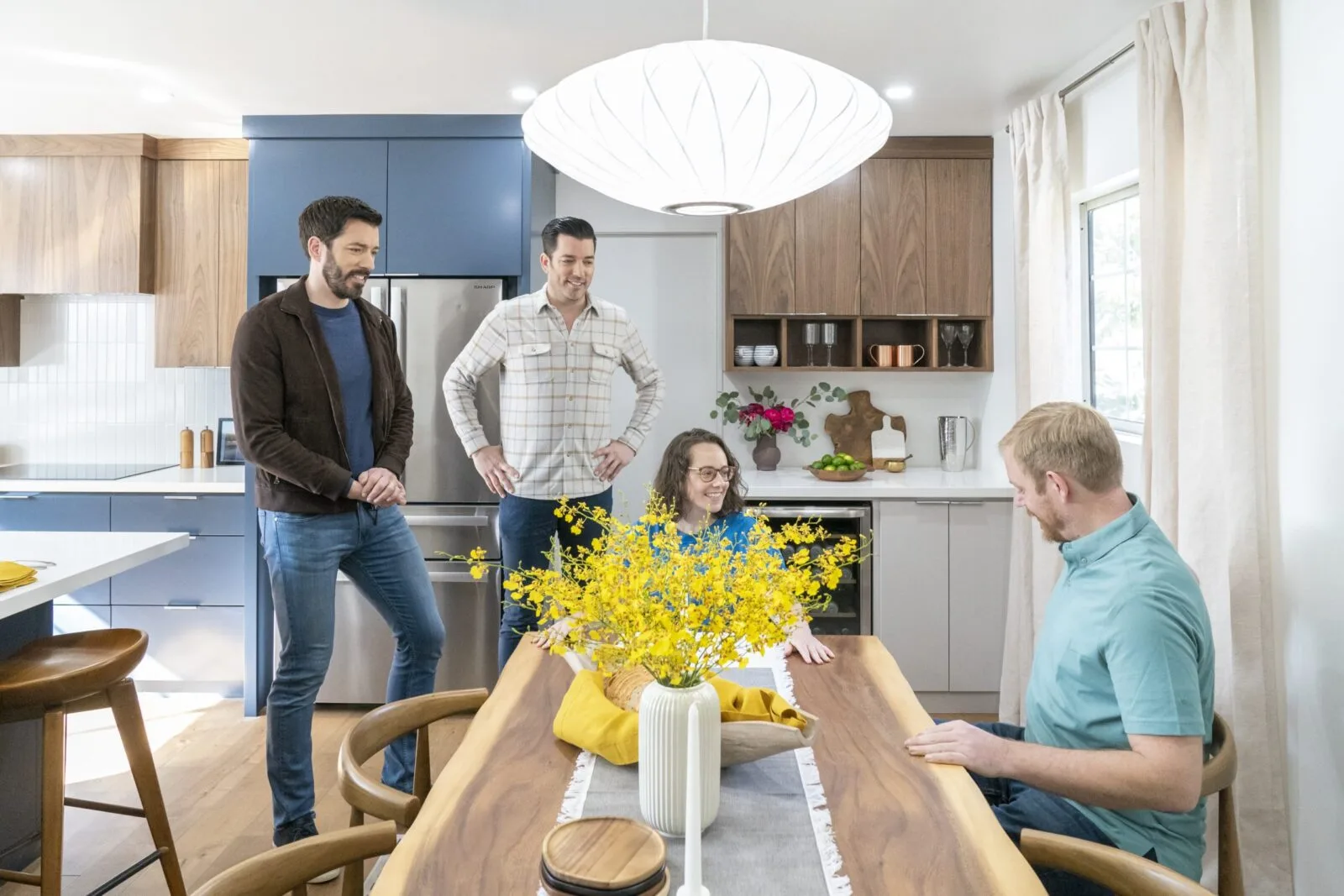
The home’s original layout included a small room off the kitchen, separated by a wall with a large cutout—great if Michelle and Ghopi ever opened a small diner in their house, but otherwise, a little strange. The family needed a true dining room, so that’s what we gave them, complete with a banquette to accommodate additional guests. We continued the powder blue into the kitchen to tie the spaces together …
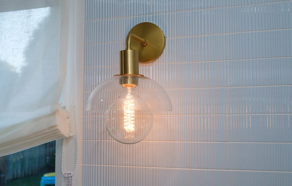
ALL TILES ARE NOT CREATED EQUAL
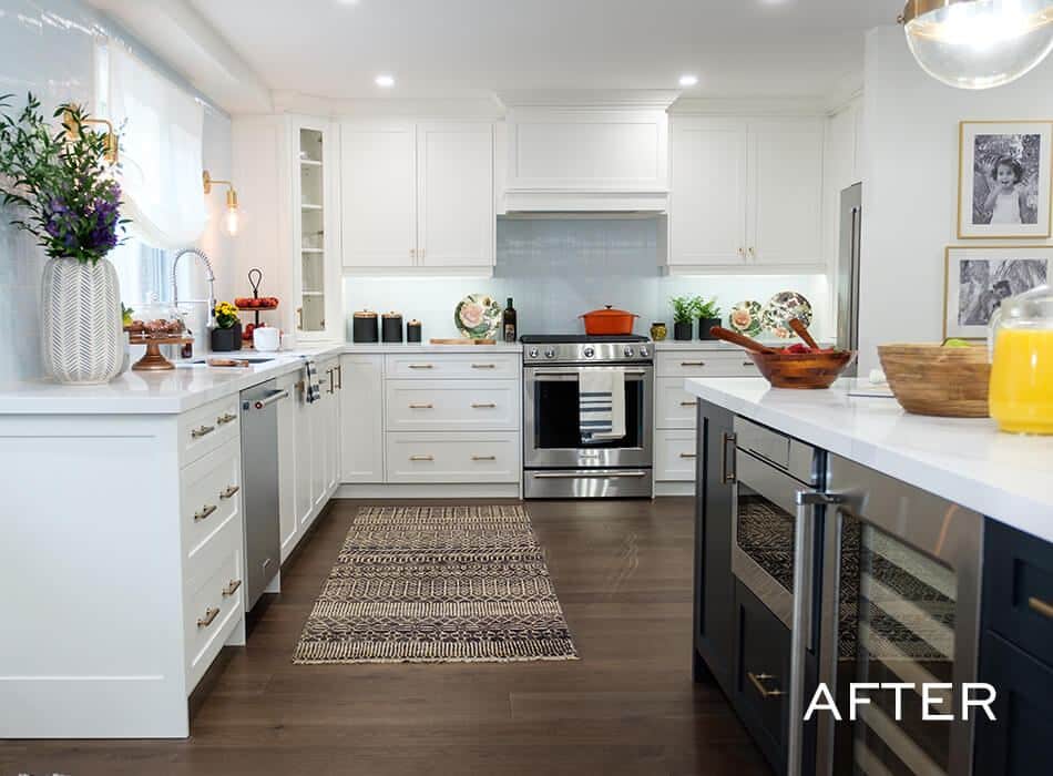
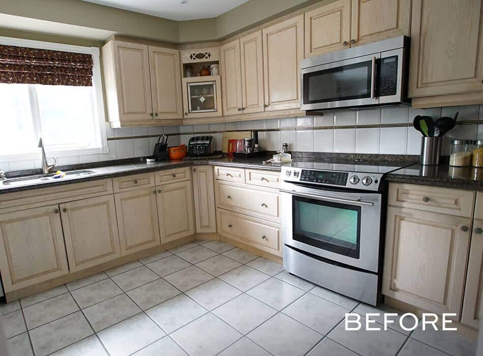
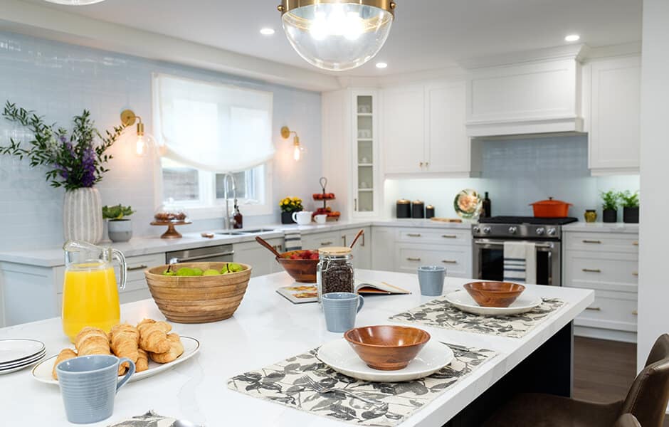
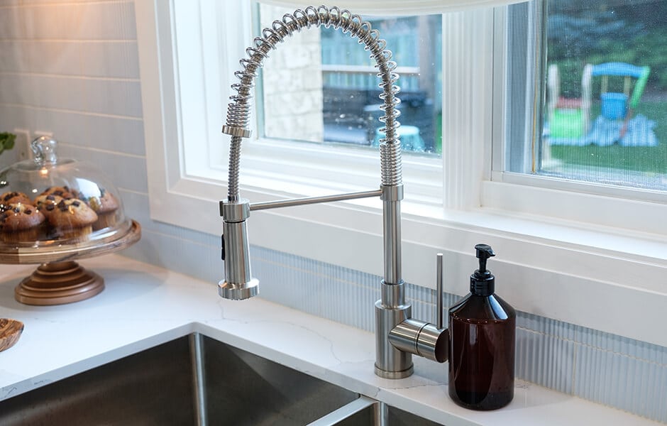
… and because it just looks so good on this textured tile. The old kitchen had massive square tiles that probably went into every house on the block when the homes were built. (Take a look at the before-after slider if you want to see those bad boys.) The new look provides a subtle but welcome contrast to the white cabinets, and adds a level of sophistication that Michelle and Ghopi deserved in their forever home.
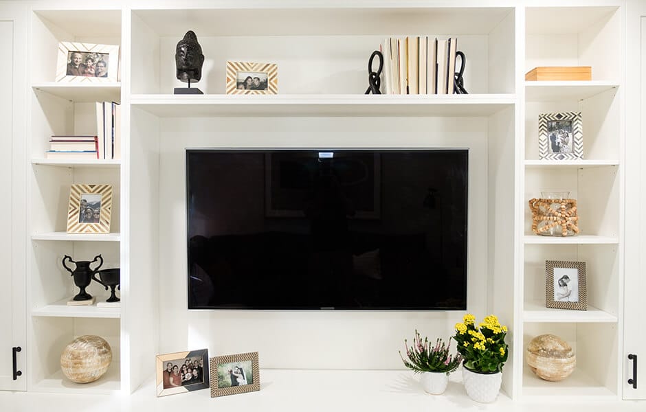
BUILD IN YOUR SCREEN TIME
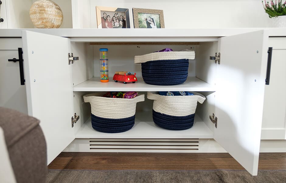
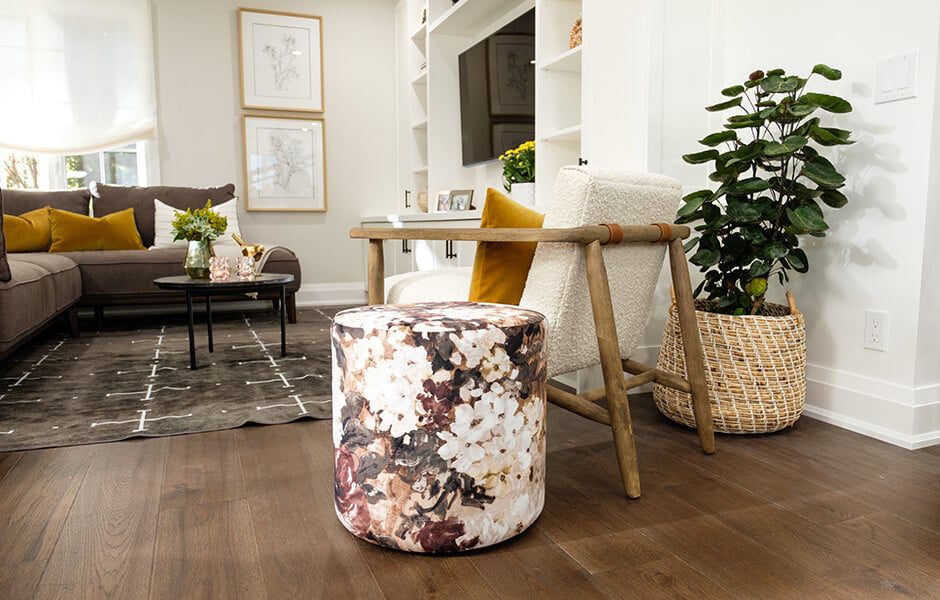
Ghopi was very focused on providing a home for the TV, which previously had lived in that funky space next to the kitchen that we converted into the dining room. But we weren’t about to turn the living room into a man cave (as much as Ghopi might have secretly wanted it). Instead, we gave them the best of both worlds: built-ins that elegantly framed the TV with family photos and accent pieces.
SPECIAL THANKS
Art Director: Melanie Hay
Construction Lead: Geno Scopelleti
