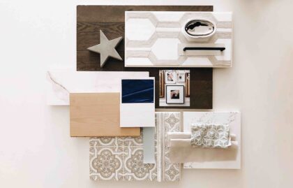
 Shabby-chic • Calming • Elegant touches • Well-defined spaces • Not a full open concept—for once!
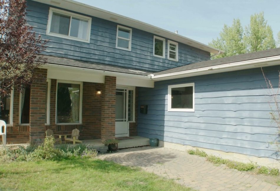
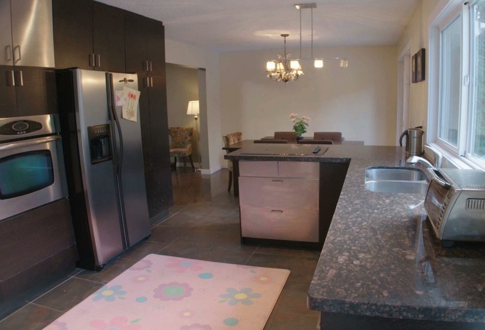
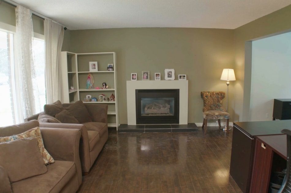
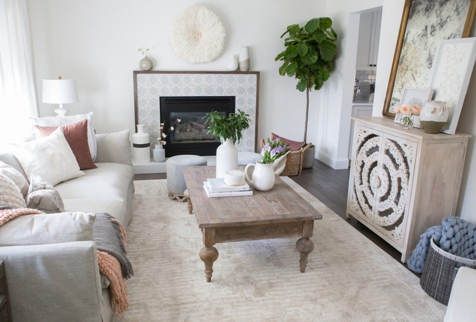
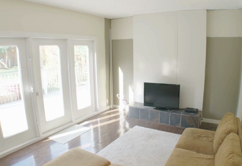
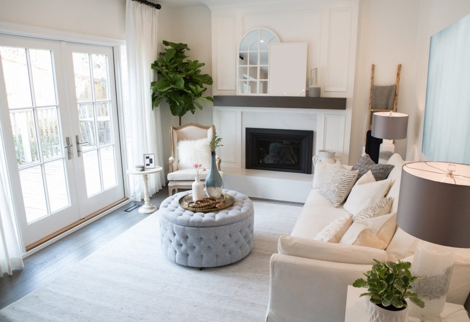
We were mentally renovating Catherine’s home before we even walked in the front door—because half of the exterior was eclipsed by shrubbery! In addition to the overgrown landscaping, the interior layout was choppy and things were falling apart in every room. (Oh, plus the asbestos.) Luckily, none of it was too much to overcome in five weeks. We added cohesiveness with hardwood flooring throughout, updated both fireplaces, and poured a lot of Catherine’s budget into the kitchen cabinetry and appliances. And, of course, we had fun infusing smart design features wherever we could.
Shop the Look
Check out the decor, furniture, and more seen in this episode–and get it for yourself!
BSS08E04 Catherine Ashley
Click below to see all of the items featured in this episode!
| wdt_ID | Room | Product Type | STYLE | Product | Company | Product Code/Sku |
|---|---|---|---|---|---|---|
| 1 | Kitchen | Range | Modernist 36" Pro Dual-Fuel Steam Range in Stainless Steel | Modernist 36" Pro Dual-Fuel Steam Range in Stainless Steel | Dacor | DOP36M94DLS |
| 2 | Kitchen | Hood Vent Power Pack | Vent Power Pack | Vent Power Pack | Dacor | RNIVS1 |
| 3 | Kitchen | Hood Vent Liner | Vent Liner | Vent Liner | Dacor | RNIHL36 |
| 4 | Kitchen | Refrigerator | Modernist 42" Four-Door French Door in Stainless Steel | Modernist 42" Four-Door French Door in Stainless Steel | Dacor | DRF427500AP |
| 5 | Kitchen | Dishwasher | Modernist 24" Dishwasher in Stainless Steel | Modernist 24" Dishwasher in Stainless Steel | Dacor | DDW24M999US |
| 6 | Kitchen | Microwave | Heritage 24" Microwave-in-a-Drawer in Stainless Steel | Heritage 24" Microwave-in-a-Drawer in Stainless Steel | Dacor | RNMD24S |
| 7 | Kitchen | Cabinet Knobs | Newport Knob in Flat Black | Newport Knob in Flat Black | Emtek | 86432US19 |
| 8 | Kitchen | Cabinet Pulls | Cup Pull in Flat Black | Cup Pull in Flat Black | Emtek | 86103US19 |
| 9 | Kitchen | Appliance Pulls | Alexander Appliance Pull in Flat Black | Alexander Appliance Pull in Flat Black | Emtek | 86643US19 |
| 10 | Kitchen | Countertop | Whistler | Whistler | HanStone Quartz | N/A |
DESIGN HIGHLIGHTS
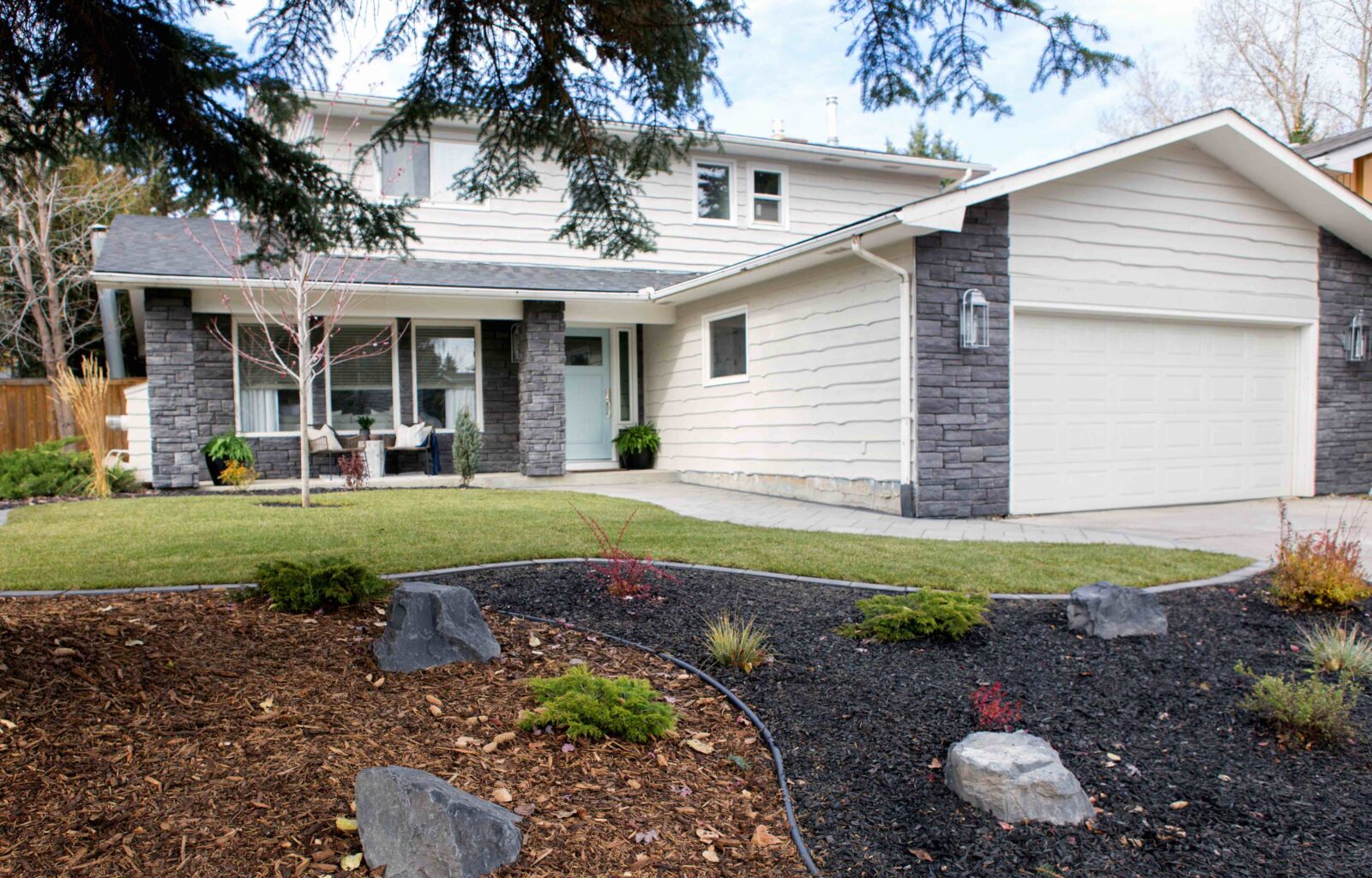
A WARM FRONT
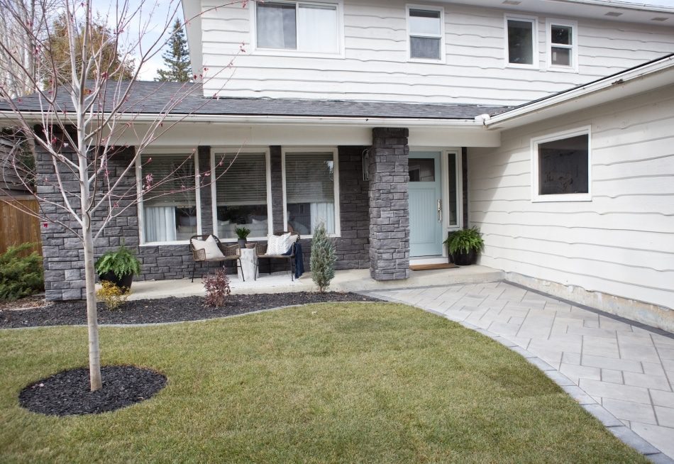
This house had a tired exterior and zero curb appeal. We started by editing the existing vegetation and bringing in new plants and trees for colorful impact. We also updated the exterior paint color, installed a powder blue front door, replaced the red brick with a gray stacked stone, and constructed a brand-new walkway so buyers have a clear path right to the front door. Say hello to the home’s fresh, elevated first impression!
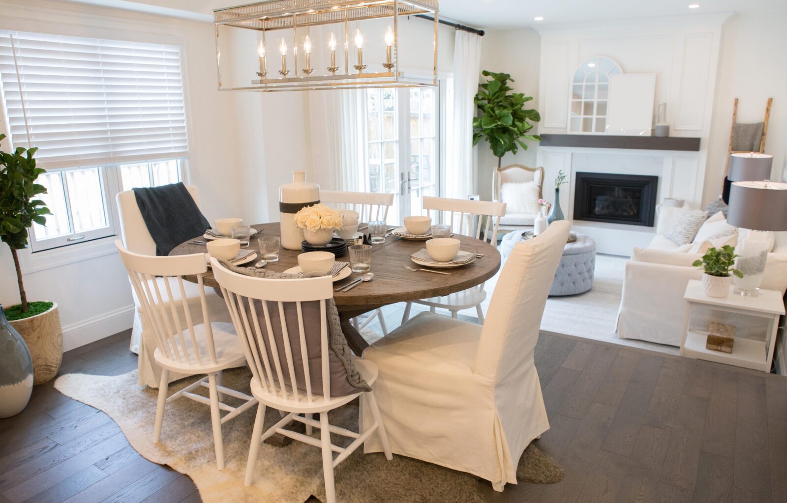
A DEFINING MOMENT
Originally, Catherine’s dining room was just kind of floating between the kitchen and family room. So we carved out a space in front of the bay window and defined it with a faux cowhide rug and an elegant overhead lighting fixture. We also more clearly defined the living room on the other side of the house—it had been sending mixed messages with both a workstation and a lounging area.
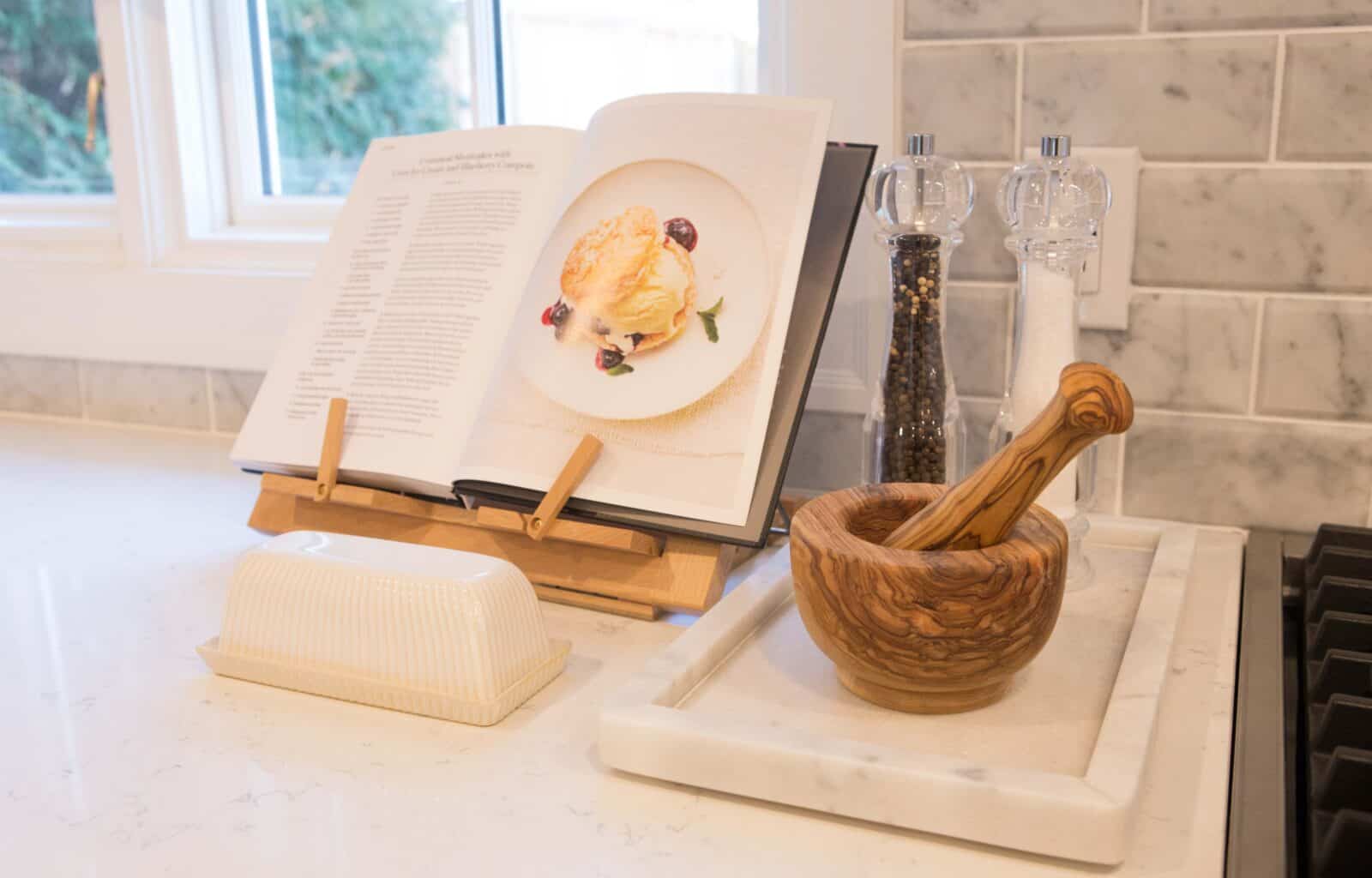
SETTING THE STAGE
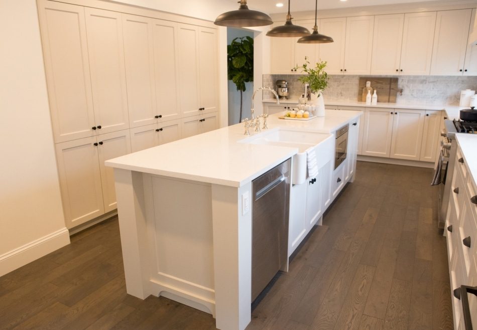
We ripped back the kitchen and gave it new life with sophisticated cabinetry, windows in place of the leaky French doors, and a suite of dreamy new fixtures and appliances. And since Catherine was putting this home on the market, staging each room so that potential buyers can picture themselves living, eating, and sleeping there was just as important as the permanent upgrades. In the kitchen, for example, we set out an open cookbook and a few simple food prep items.
