3 Paint Colors That Are Always in Style
This site contains affiliate links to products. We may receive commission for purchases made through these links. Price at time of publish date may change.
While we’re big fans of color and contrast here (have you seen our new Scott Living wallpaper collection?!), we also love the way timeless design details can pull together a room. When you have a focal point you’re working with—like a gallery wall, a living wall, or even a standout piece of furniture that commands the attention of the room—a neutral backdrop is key to making your space look well-designed. In cases like this, you need paint colors that will always be in style; ones that will elevate your decor and allow you to let your creative flag fly in other ways.
Timeless paint colors for your home don’t have to be boring, either. Work with undertones, your room’s unique lighting, and the room’s furniture and decor to pull colors that blend seamlessly into your space. You can also experiment using paint sample cans or peel and stick paint samples to help you find that perfect hue. Just like some of our haircuts over the years (ahem, Drew…), certain paint colors drift in and out of style. To avoid another big paint project in the near future (or rather than waiting for lime green to become trendy again), we suggest sticking with these versatile options for an elevated, classic look throughout your home.
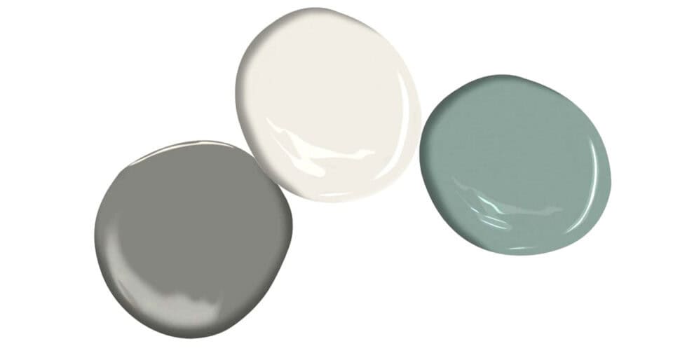
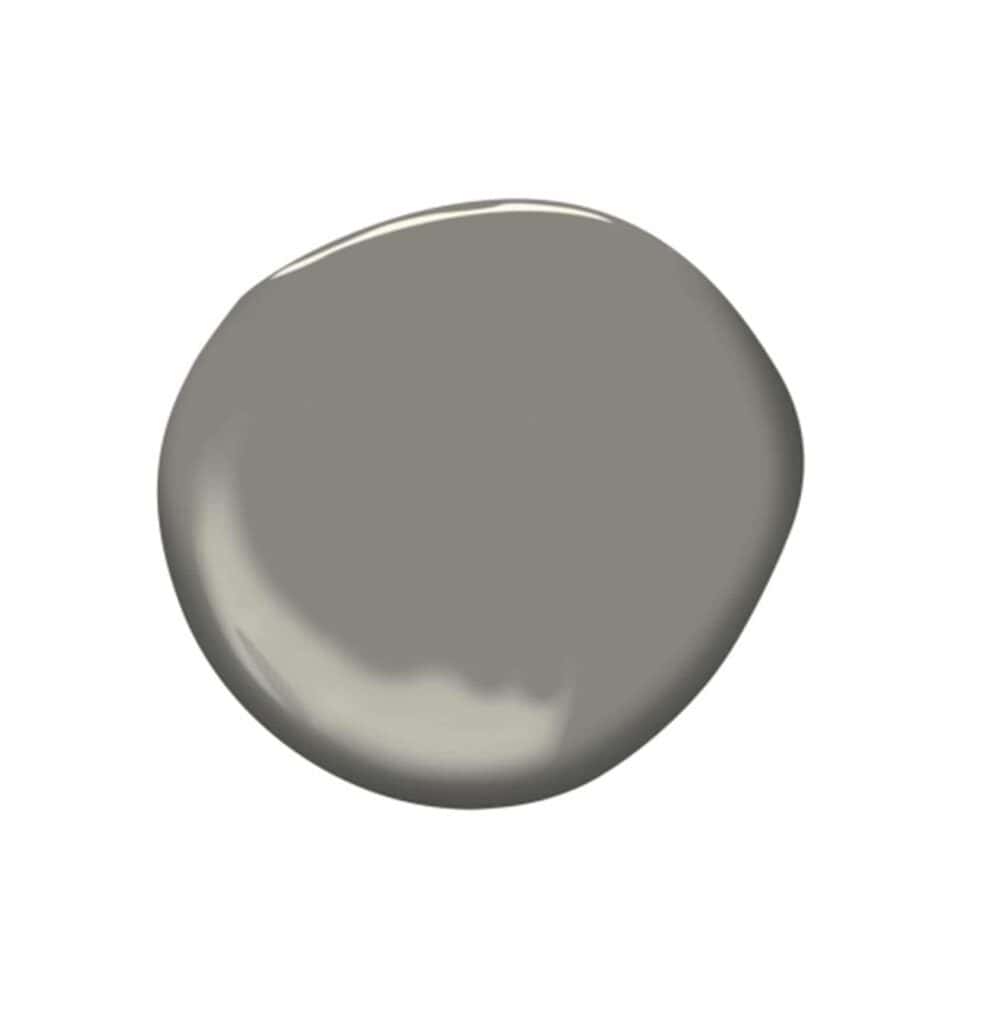
1. A Graceful Gray
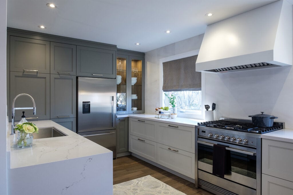
On Dana and Terry’s episode of Buying & Selling, the kitchen cabinets needed a sleek upgrade. Our solution: painting them a uniform, elevated color that blends with the rest of the main floor. Enter Benjamin Moore Chelsea Gray, which the popular paint company describes as a “well-dressed gentleman”—we can’t argue with that! Against the sleek stainless steel appliances and off-white cabinetry, this gray offers the perfect amount of contrast.

2. A Not-So-Bright White
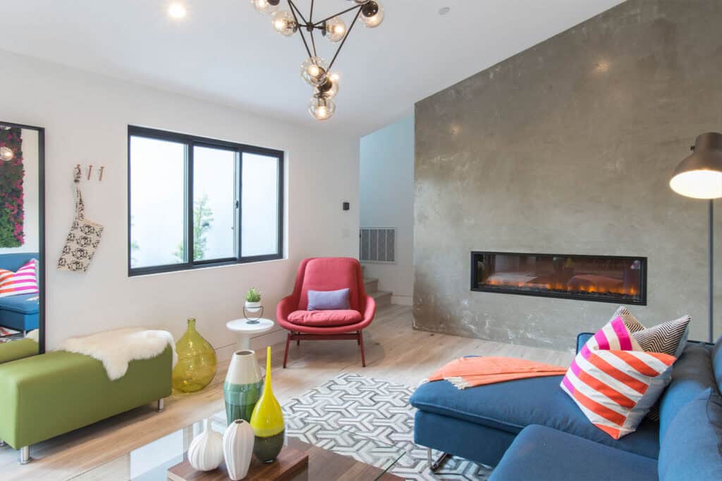
During the first challenge on season 6 of Brother vs. Brother, Jonathan coated his living room and foyer walls in a velvety white paint that allowed the space’s standout features—a plaster fireplace wall and a stunning moss installation—to command the attention of the room. He used Kelly Moore White Cloud, but White Dove by Benjamin Moore is a lovely alternative. The versatile color is beautiful for any interior space because its soft yellow undertones reflect light and brighten the room without it looking sterile.


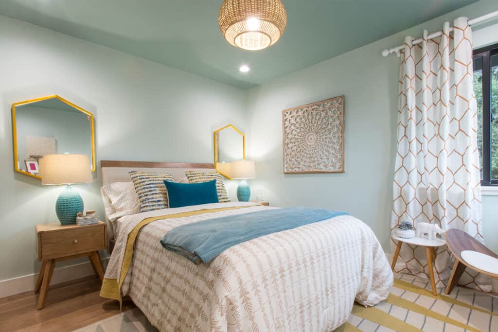
3. A Soft Blue-Green
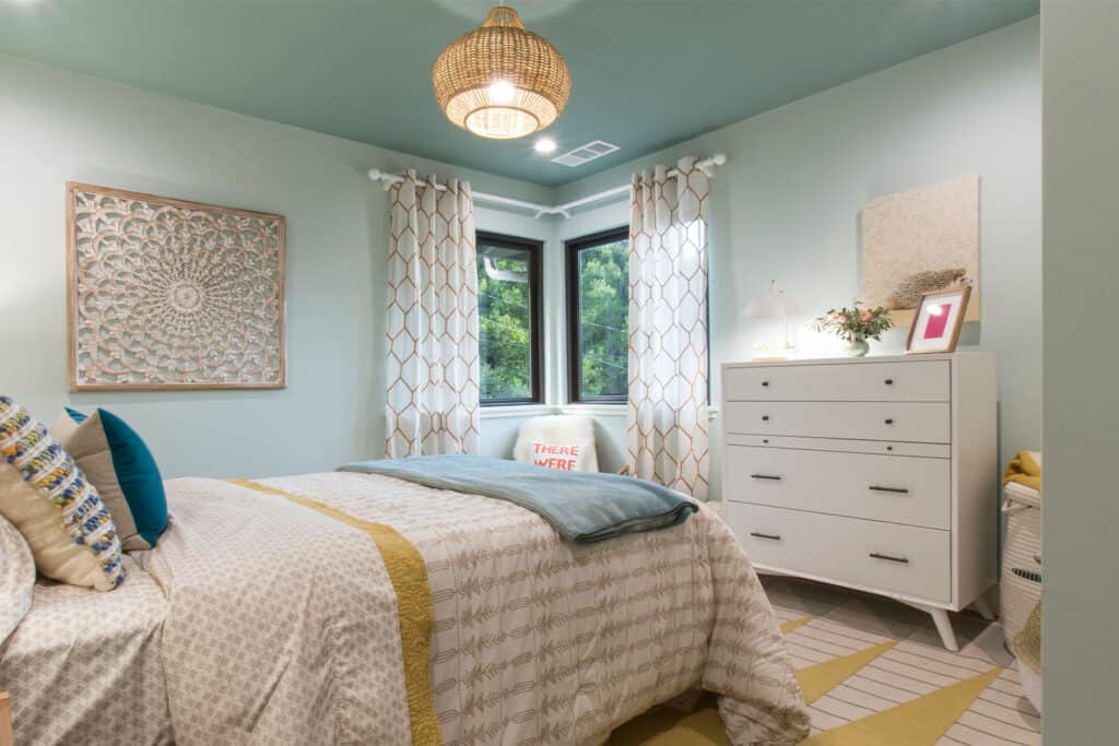
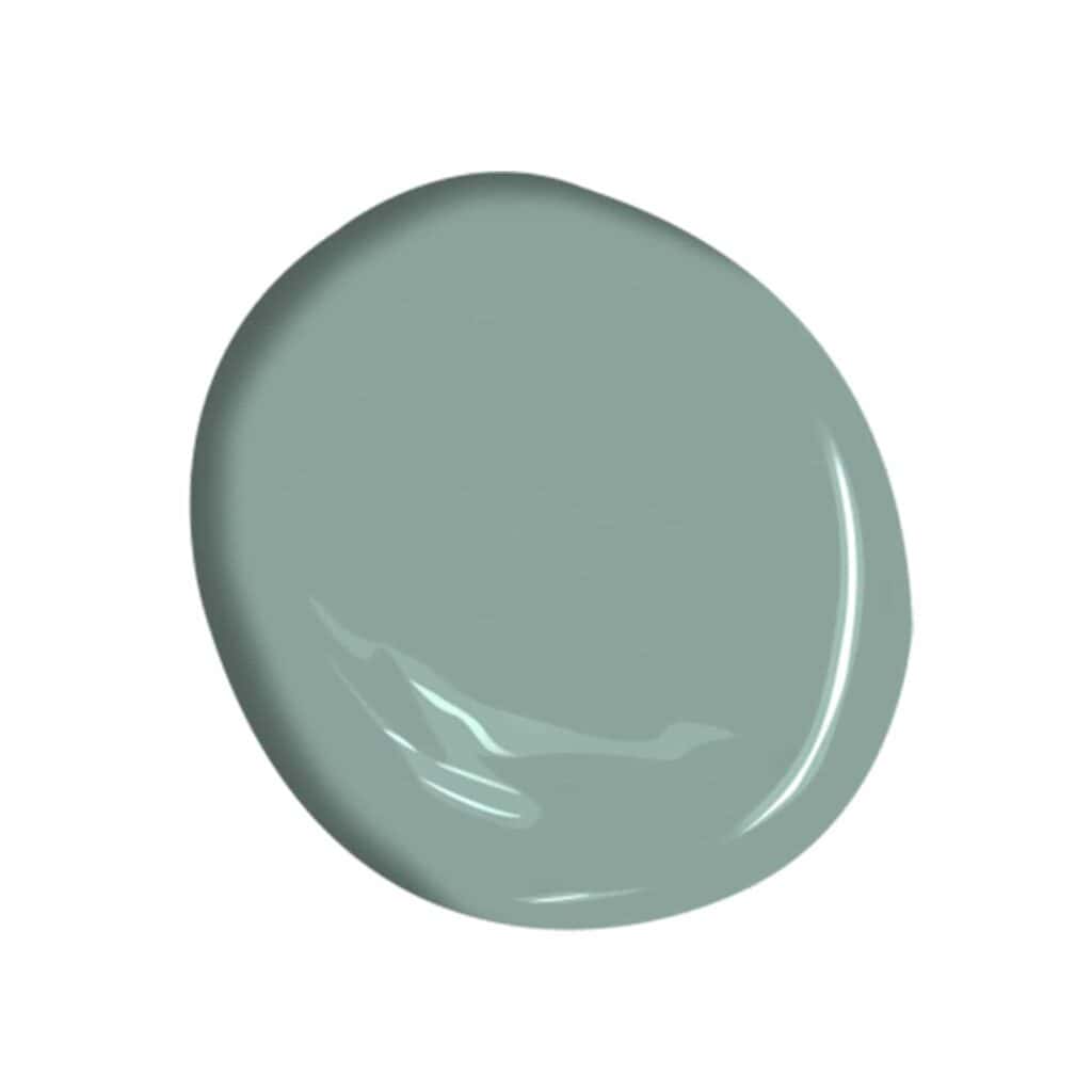
In the same season of Brother vs. Brother, Drew was seeing green in one of his guest bedrooms. He opted for a light turquoise shade on the walls, and went a touch darker on the ceiling for a cool contrast—he actually painted and repainted, finally finding perfection in Benjamin Moore Grenada Villa. This soothing shade would also look good in a powder room with dark accents or splashed across a freestanding cabinet for a pop of color.
Don’t Forget Your Paint Supplies!