Every Color of the Year for 2025 That We Know So Far

This site contains affiliate links to products. We may receive commission for purchases made through these links. Price at time of publish date may change.
Each year, creative companies, design houses, and paint manufacturers enlist the help of their teams to help determine their Color of the Year for the 12 months ahead. Depending on the brand, the chosen hue can be determined by a variety of factors—from trend reports and industry analyses to consumer data, global experiences, color mapping, and so much more. Pantone specifically has led the pack in color trends for the past two decades, with their Color of the Year used as the informal symbol for lifestyle trends and the world’s large-scale zeitgeist. In 2025, there has been a slurry of colors predicted from brands like Benjamin Moore and Sherwin-Williams all the way to Pinterest, Krylon, and more.
While we’ve sifted through the trending colors to bring you an all-inclusive guide, we’re dreaming of new ways to decorate our homes—and there are so many to take inspiration from! The colors, shades, and undertones chosen tell separate stories from brand-to-brand, which begs the question: Which Color of the Year will turn out to be the truest prediction? We’ll have to wait until December to find that out, but for now, we’re feeling creative and inspired by all these gorgeous hues. From plummy purples to moody blues and lush mochas, here’s a look into all the Colors of the Year for 2025 that we’ve seen so far.
Pinterest’s 2025 Palette of the Year
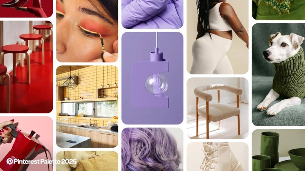
Where many Colors of the Year for 2025 seem to lean into robust, neutral, even moody hues, Pinterest has crafted an entire color palette to tell this year’s story—and it’s vibrant. The Pinterest Palette of the Year is made up of Cherry Red, Butter Yellow, Aura Indigo, Dill Green, and Alpine Oat. Pinterest is anticipating these dreamy colors taking off throughout the coming months. And based off their Pinterest Predicts trend report from last year, we gotta say, we trust them!
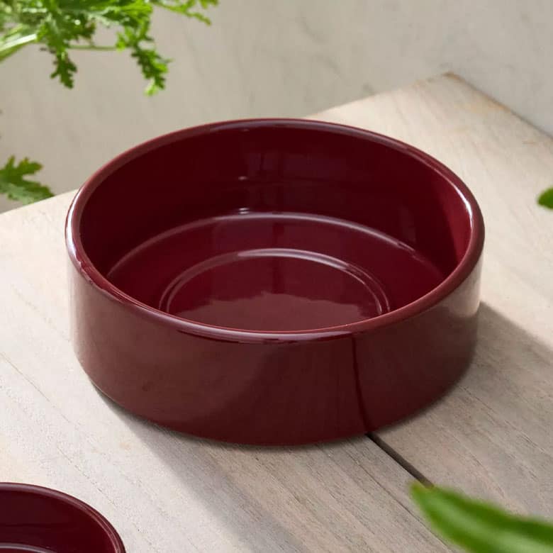
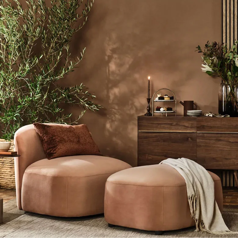
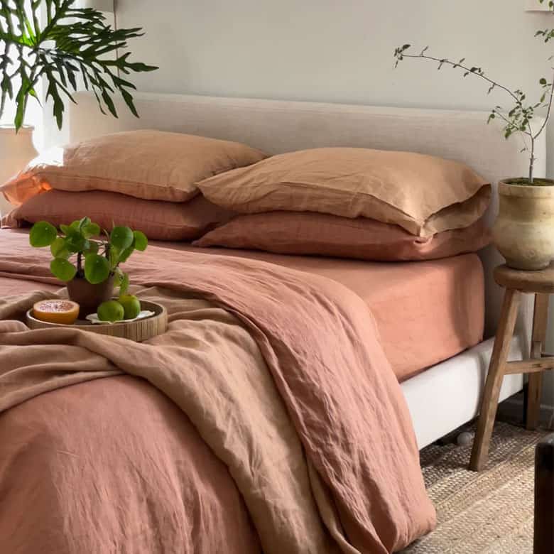
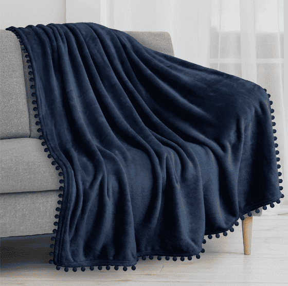
Mocha Mousse by Pantone
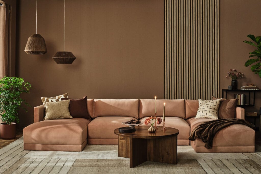
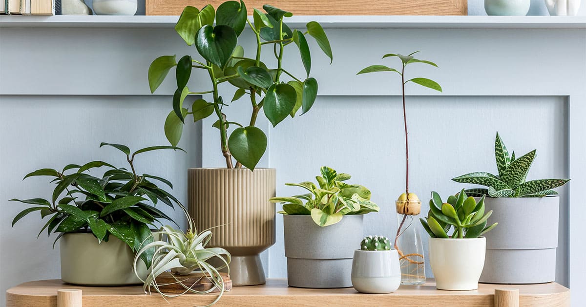
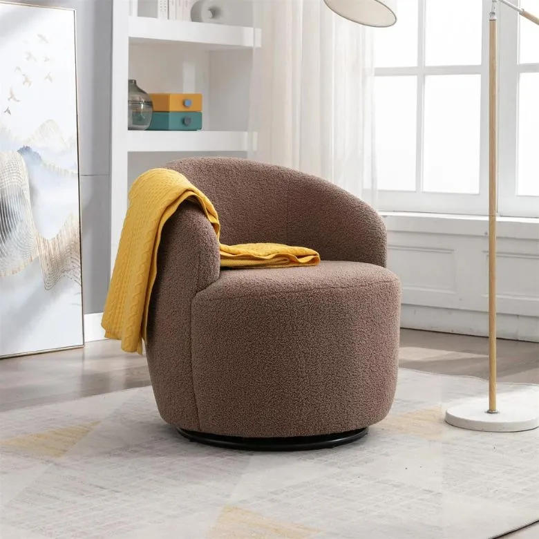
The Pantone 2025 Color of the Year, Mocha Mousse, is a rich, sensory hue that reflects the cozy qualities that we see in a cup of coffee or a lavish chocolate dessert. “Mocha mousse expresses a level of thoughtful indulgence. Sophisticated and lush, yet at the same time an unpretentious classic,” says Leatrice Eiseman, Executive Director at Pantone Color Institute.
Mapped Blue by Dutch Boy Paints
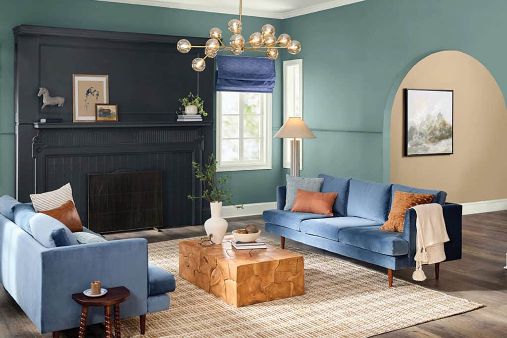
Dutch Boy Paints determined their Color of the Year based on its timeless appearance and the “growing consumer interest in spaces that promote well-being and longevity.” The serene, calming blue acts as a much-needed reprieve from everyday chaos and is a gorgeous addition to any space that needs a touch of color. Slightly yellow undertones make this blue uplifting and elegant. Pair with dark-toned wood accents and unexpected pops of peach for a well-rounded palette.
Elderton by Graham & Brown
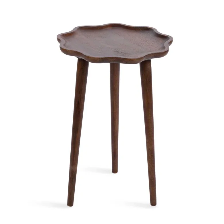
Graham & Brown’s robust and chocolatey Color of the Year for 2025, Elderton, takes its inspiration from nature—more specifically, the Elder Tree. This rustic brown would be particularly charming alongside other earthy shades, and dynamic, too, due to its red-grey undertones. We picture it being used to color-drench an entryway, or even sprinkled throughout the home with dark wood accent pieces.

Caramelized by Dunn-Edwards
Another warm shade of taupe, Caramelized is an earthy hue that will complement anything from vintage-inspired interiors to modern spaces looking for a subtle contrasting tone. Similar to the indulgent Mocha Mousse, Caramelized makes a statement as an approachable yet sophisticated color.

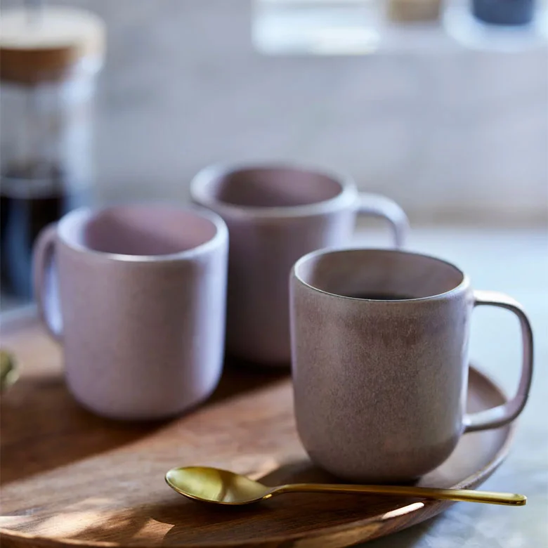
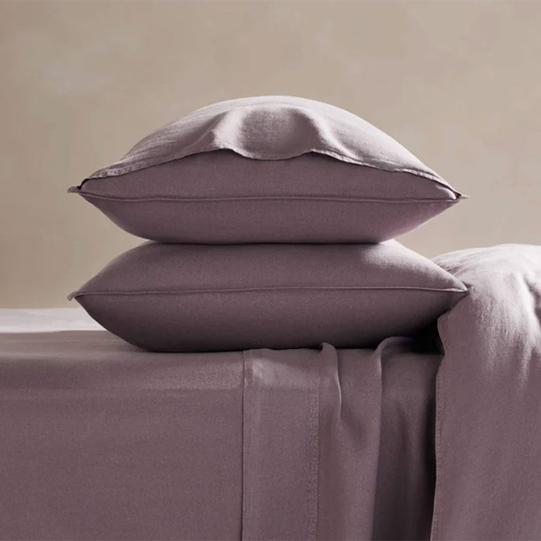
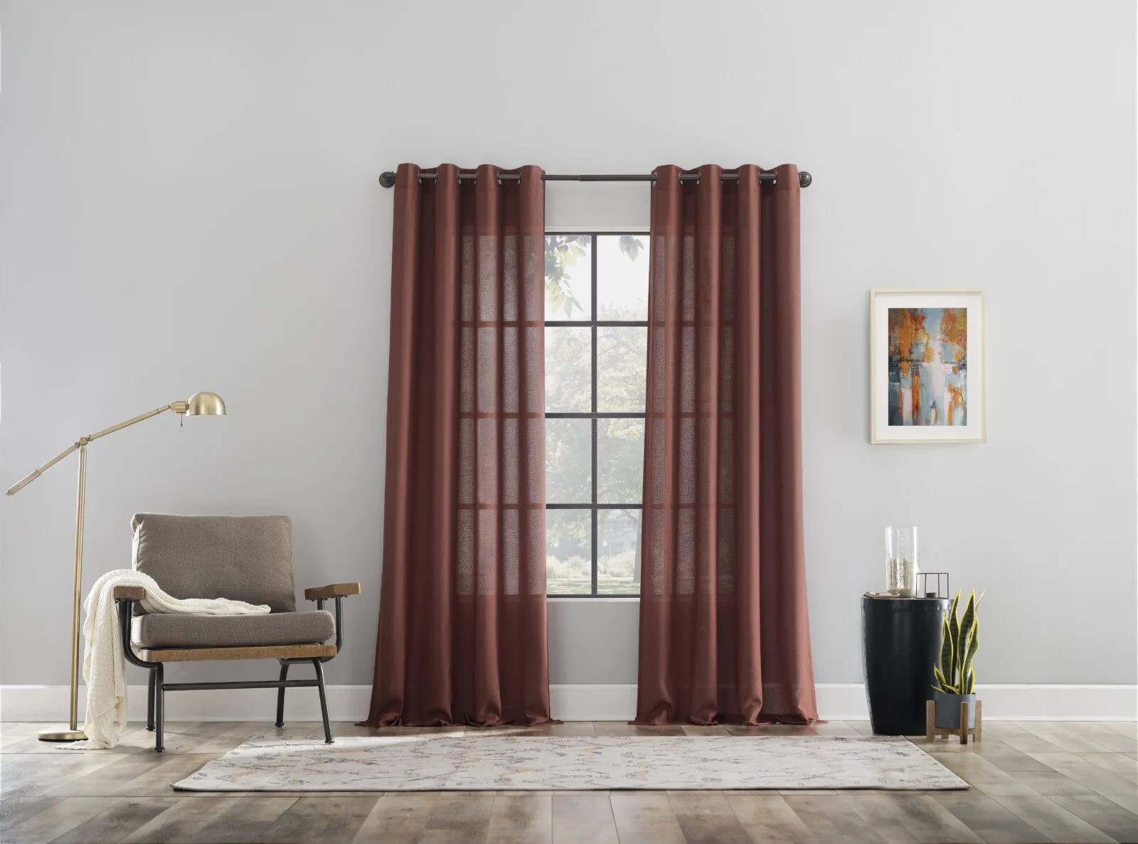
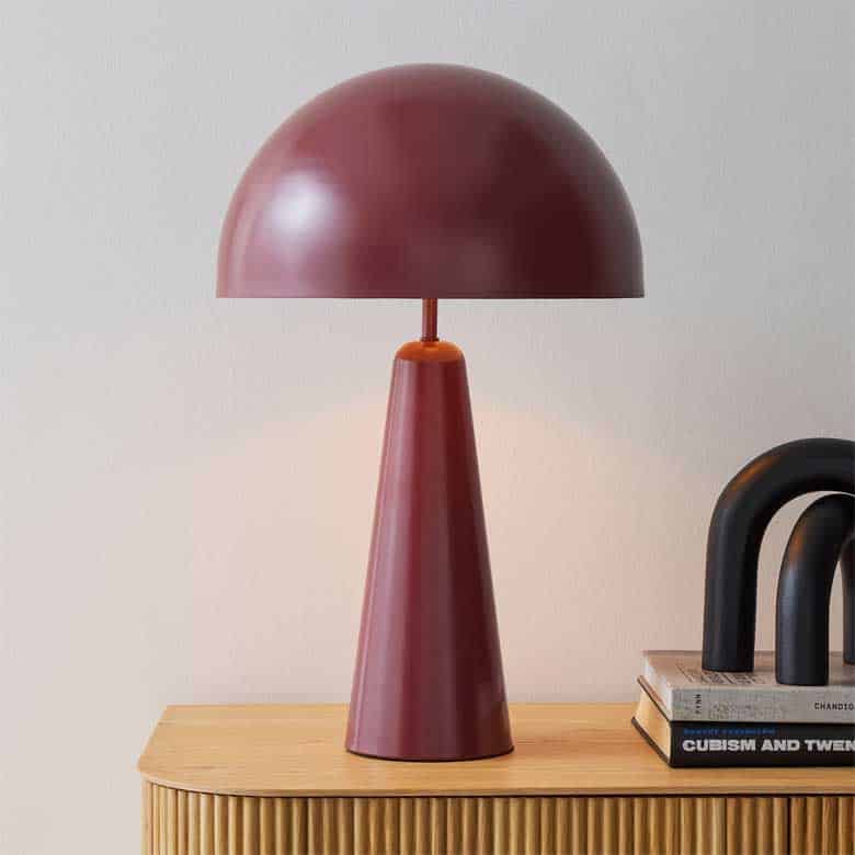
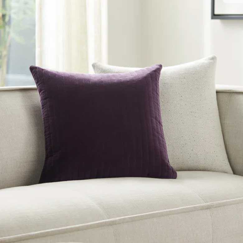
Cinnamon Slate by Benjamin Moore
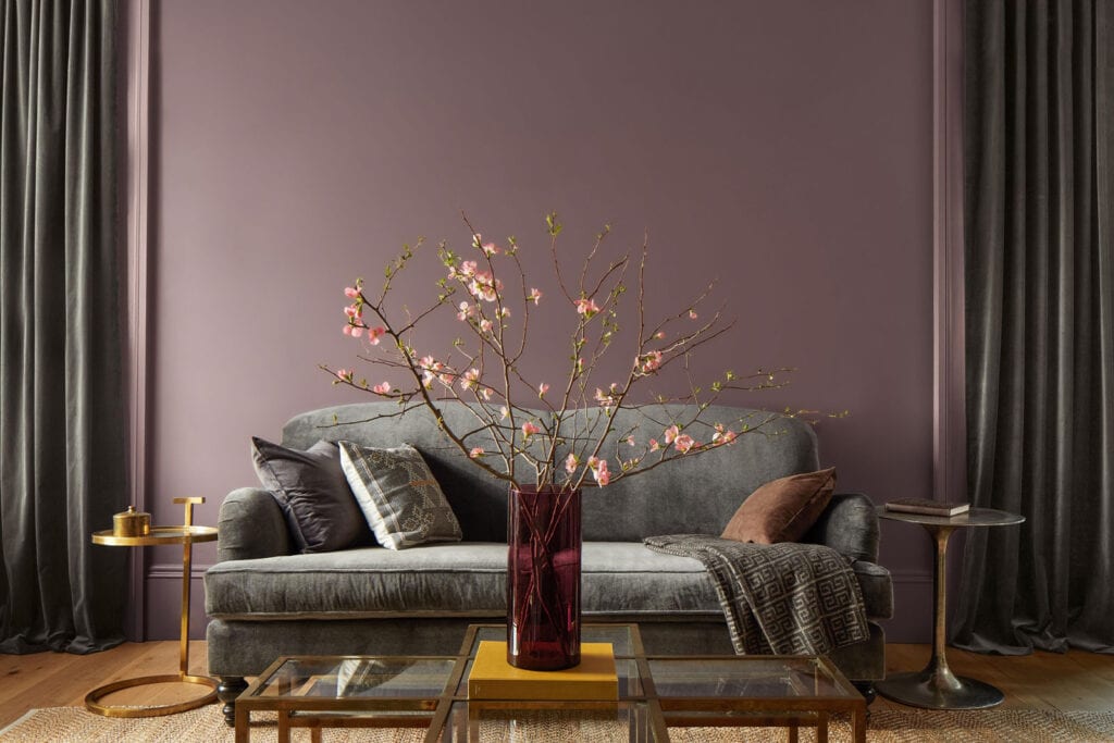
Benjamin Moore’s Color of the Year for 2025 leans into the same lush browns that we see in many others, but with a plum-toned touch that helps create a unique and luxurious—but still very versatile—finish.

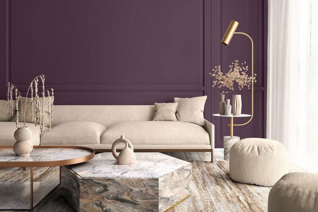
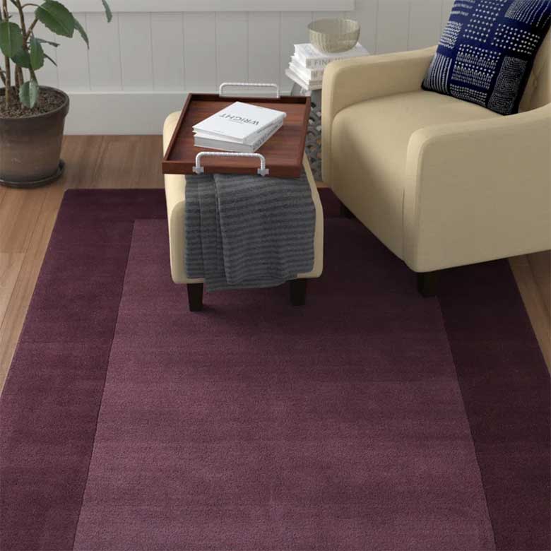
Rumors by Behr
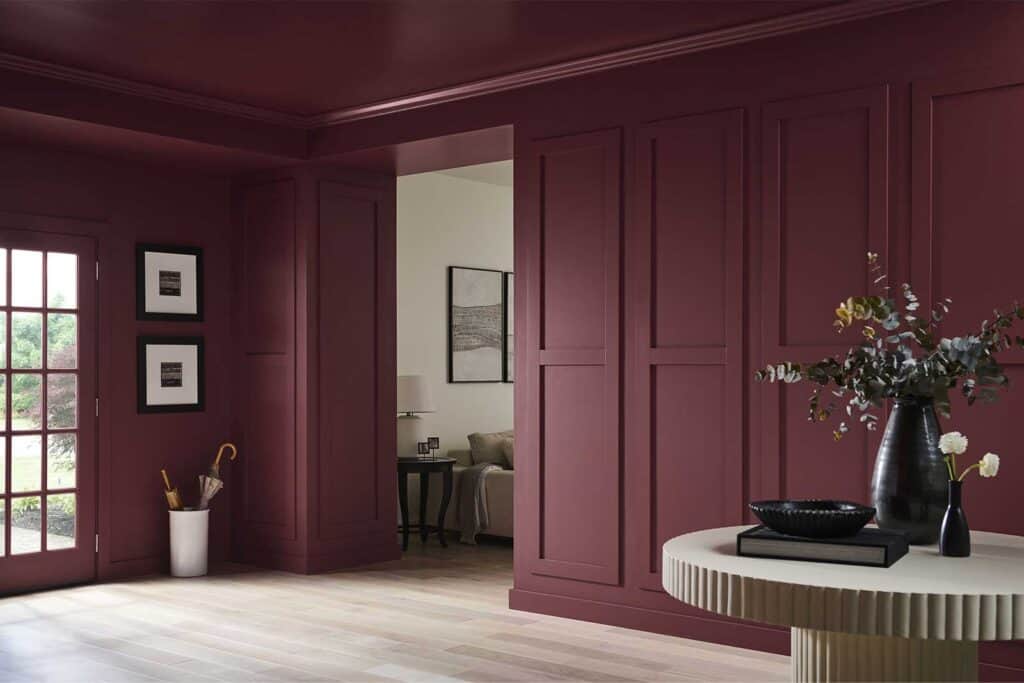
We spoke about Behr’s Color of the Year earlier this fall, but we see now how it compares to other Colors of the Year, and it looks like Behr had the right idea! Rumors is an alluring, plum-ruby red color that is both inspiring and a bit daring. Complemented by warm neutrals, it will sit beautifully as an accent or drenched in a room from wall-to-ceiling.
Sherwin-Williams’s Color Capsule of the Year
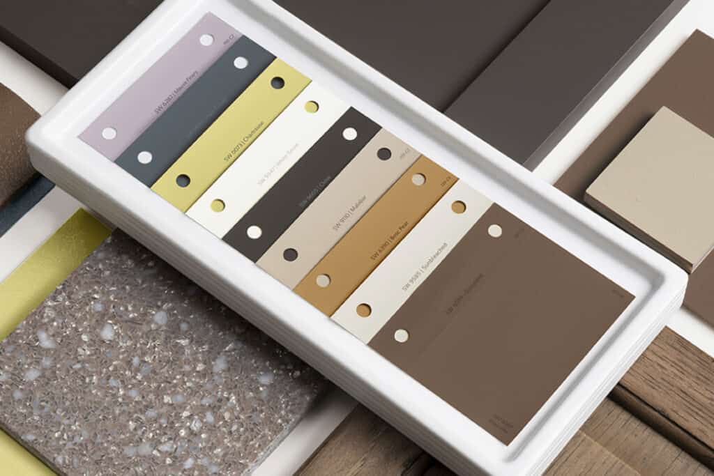
Sherwin-Williams broke new ground this time, putting out its first-ever Color Capsule of the Year, which includes: Grounded; Sunbleached; Chartreuse; Bosc Pear; White Snow; Rain Cloud; Clove; Malabar; Mauve Finery. Several shades of soft, grounded colors combine to form a beautiful palette that evokes interest and contrast. “We wanted a modern, fresh take on color, with a balanced and usable assortment of shades,” said Sue Wadden, Director of Marketing at Sherwin-Williams.

Purple Basil by Glidden
A moody but dynamic shade of violet, Purple Basil is unexpected and confident. Lovers of bold pops of color will appreciate Purple Basil for its ability to fit into a variety of spaces and the warm tone that helps make it feel welcoming in the home.
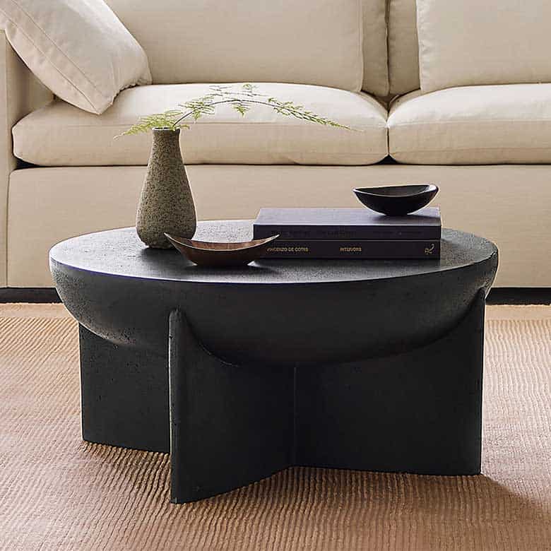
Hammered Black by Krylon
Krylon’s 2025 Color of the Year is making an impact. The textural, dimensional hue is both versatile enough for plenty of at-home projects but also bold enough that it will make a statement. For a shade of black, this color is actually quite responsive to light, and provides a nice dimensional hue for anything from chairs and drink tables to vases and picture frames.
Encore by Valspar
Valspar’s Color of the Year, Encore, is making waves as it’s one of the only hues on our list that leans into cool tones. The true-blue shade is calming, yet bold and lively. “As we seek a joy-filled life, this approachable and livable ultramarine creates a perfect backdrop for happiness in the home,” said Sue Kim, Director of Color Marketing at Valspar.
Truffle by STAINMASTER
Lowe’s exclusive STAINMASTER paint has just revealed their chosen shade to represent the 2025 season, and it mimics the same rich caramel tones as Pantone, Dunn-Edwards, Sherwin-Williams, and C2 Paint. Truffle embodies a more neutral shade of brown, making it an easy addition to many different interior styles.
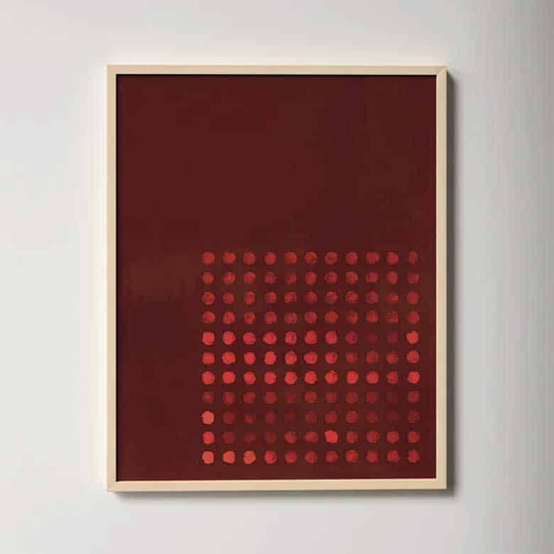
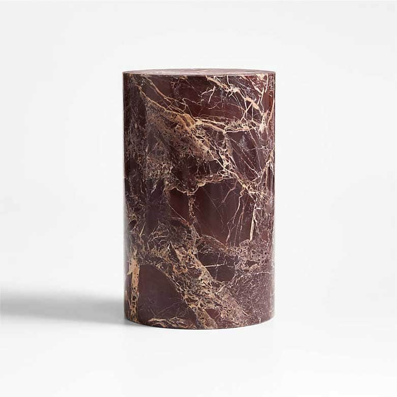
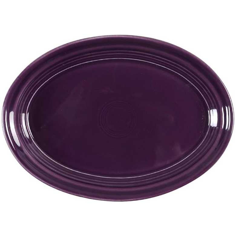
C2 Raku by C2

C2 Raku is inspired and layered—a robust mix of burgundy and brown, with a note of violet. According to the C2 site, the color was “inspired by the ancient Japanese tea ceremony,” and “draws from a centuries-old pottery technique known for its unique, variegated patterns.” The shade is opulent and sophisticated, with a bit of edge that gives it its interest.