The Most Jaw-Dropping Reveals from ‘Property Brothers: Forever Home’
This site contains affiliate links to products. We may receive commission for purchases made through these links. Price at time of publish date may change.
Property Brothers: Forever Home first aired in 2019, and since then, Drew and Jonathan have helped families craft beautiful spaces in their loving homes. Along the way, there’s always a few twists and turns and unexpected hiccups. But in the end, it all comes together. Our favorite Property Brothers: Forever Home transformations not only make our jaws drop, but they also inspire us. Sometimes Forever Home final reveals even end up looking like entirely different homes, with newfound functionality and style.
Forever Home renos come in a variety of shapes, sizes, styles, and situations, but one thing rings true each time: Every reno has to fit the specific needs of each family. And those needs can vary a lot! Some have guest bedrooms they need to make cozy, some have half bathrooms in need of a major facelift, some have kids and need seriously smart storage solutions, and others need a room to completely transform into a different space. Whatever the dilemma, the Brothers tackle it together. And as we can see from these Before and Afters, they’re not messing around! Keep scrolling to see this list of our top truly impressive Forever Home makeovers. Don’t forget to download MAX so you can stream all episodes of Property Brothers: Forever Home whenever, wherever.
A Home Gym Dojo
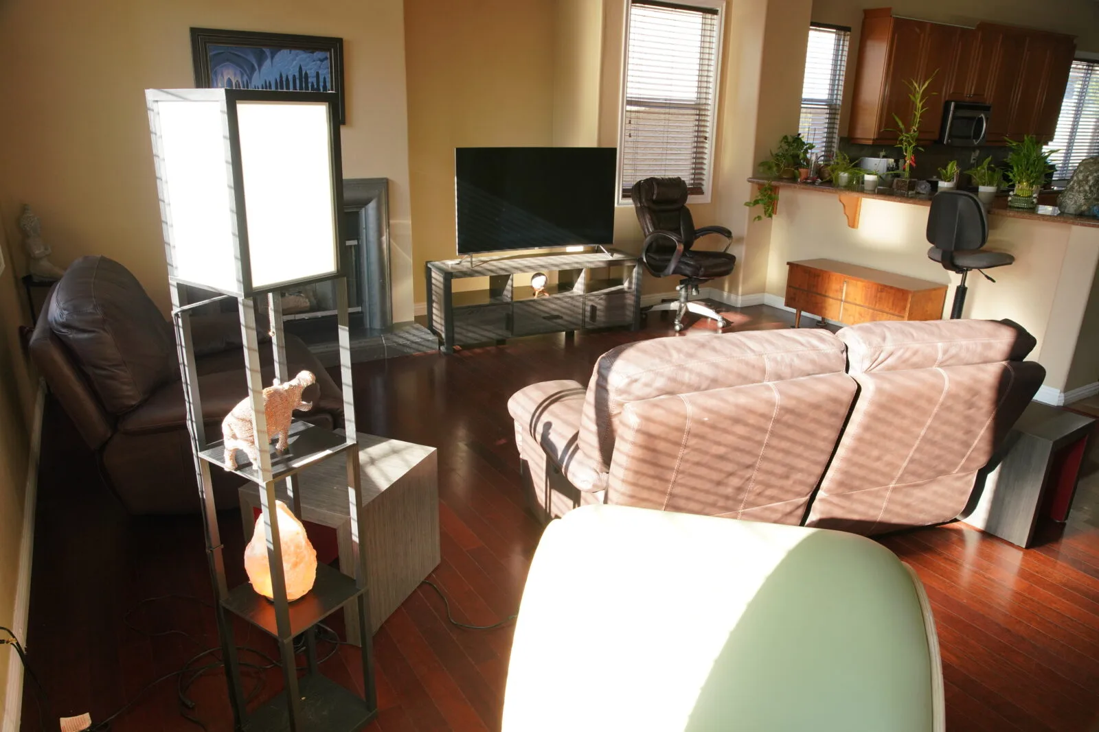
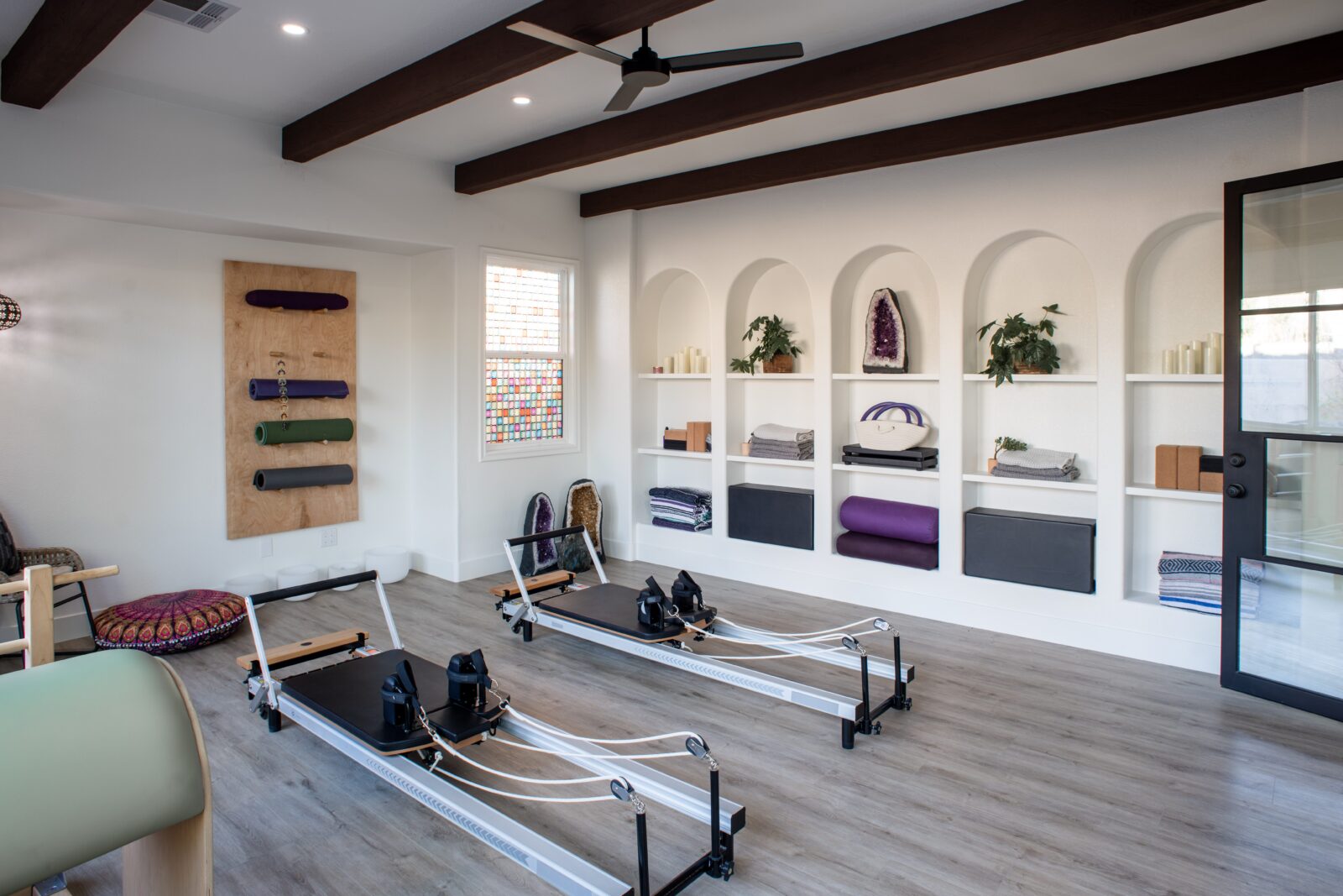
Would you rather: An outdated, dimly-lit living room that’s barely functional, or a bright, open, and gorgeously crafted home gym, complete with pilates reformers and built-ins for equipment? Do we even have to ask? This Property Brothers: Forever Home reveal for Marcie and Alyssa swept us off our feet.
A Bright and Bold Breakfast Nook
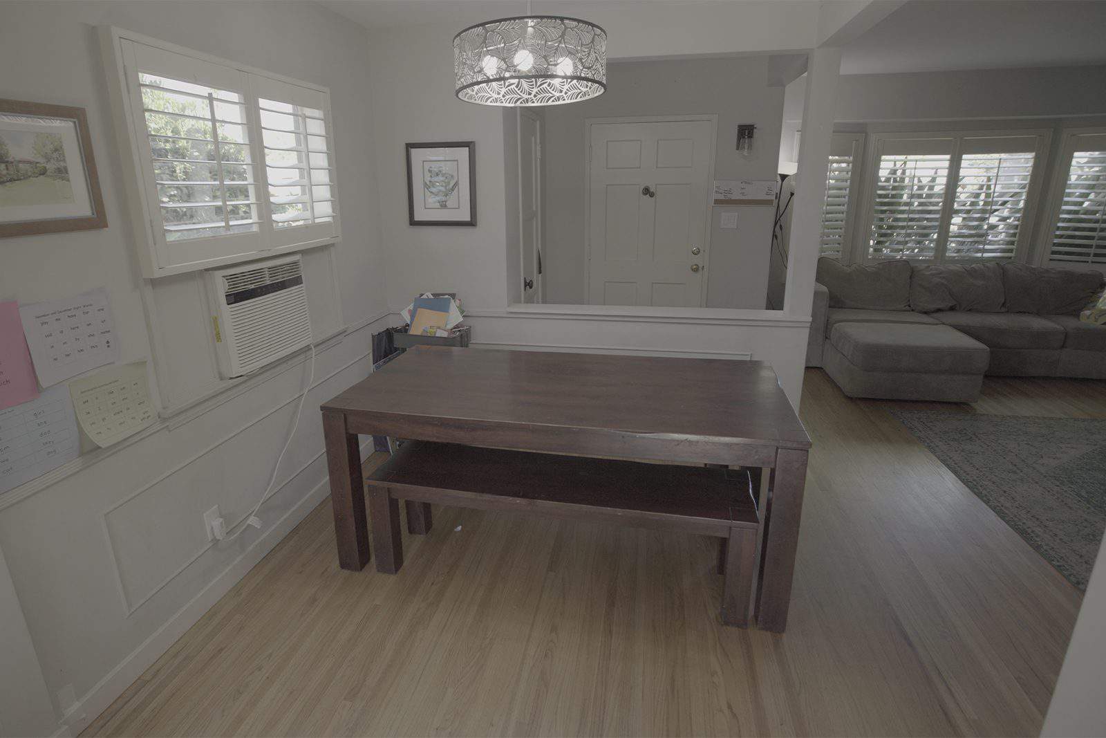
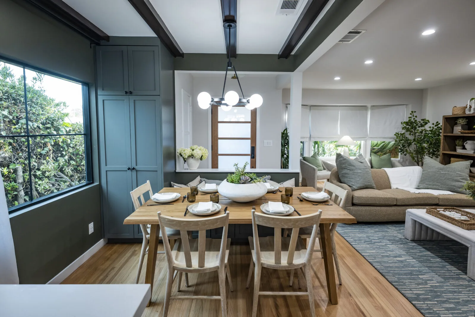
What was once a drab and one-dimensional kitchen corner grew up to be a comfortable, colorful breakfast nook for Jessica and Kathy. Drew and Jonathan expanded the window, almost doubling the natural light coming in. They also added in more functional furniture to the space and incorporated natural wood to create warmth.
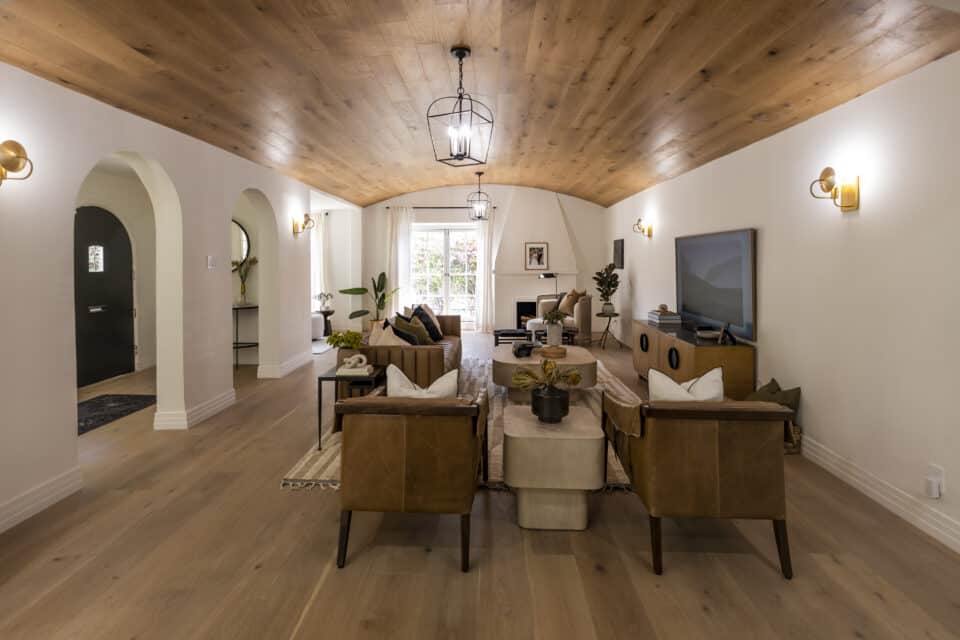
A Warm and Stylish Living Room
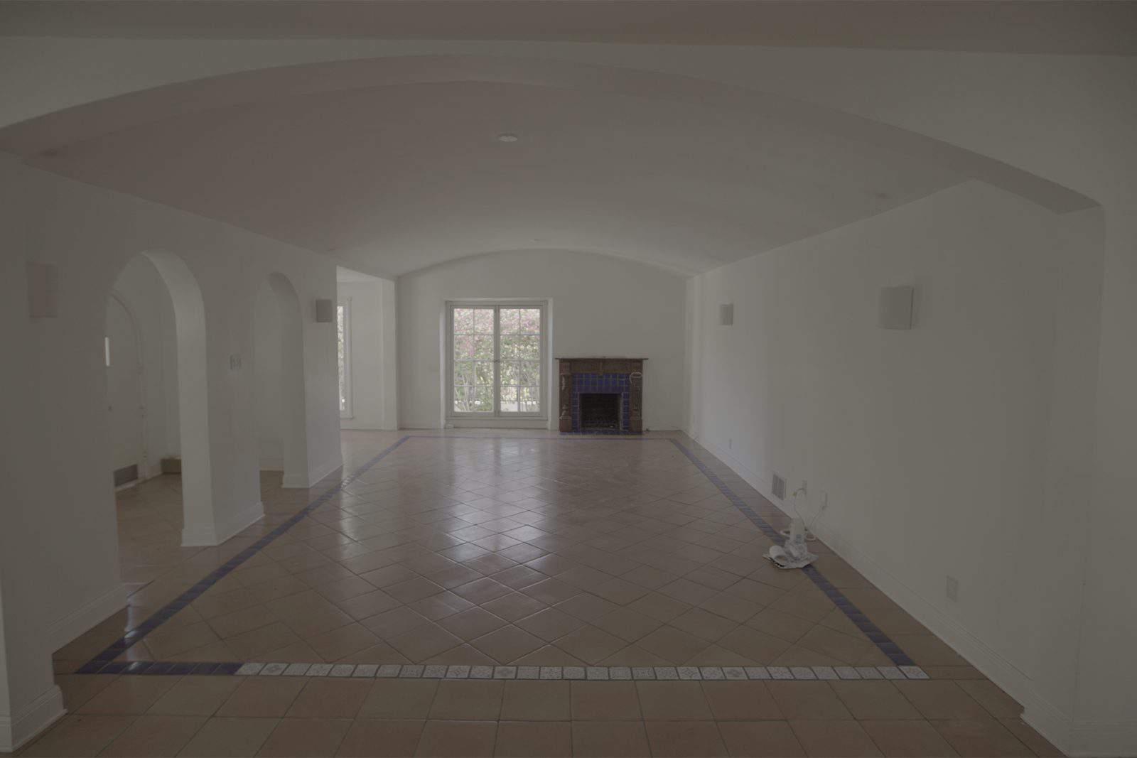
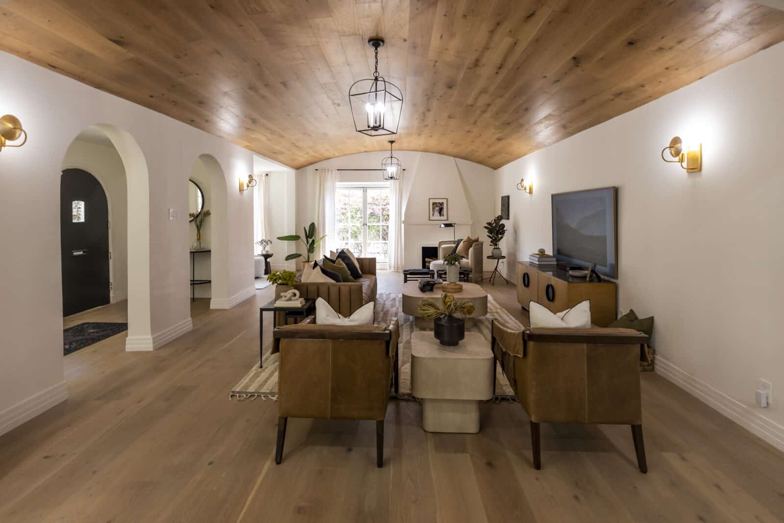
Feast your eyes on this picturesque living area made for Emily and Adhir. When the Bros first saw the space, it felt a little lifeless. There wasn’t any warmth or much lighting, and the space looked dull. So they creatively introduced hardwood on both the floor and ceiling, and installed wall sconces and a chandelier. Organic shapes complemented the arches into the hallway, and helped make the room feel so much more relaxing.
The Perfect Bubble Bath Bathroom
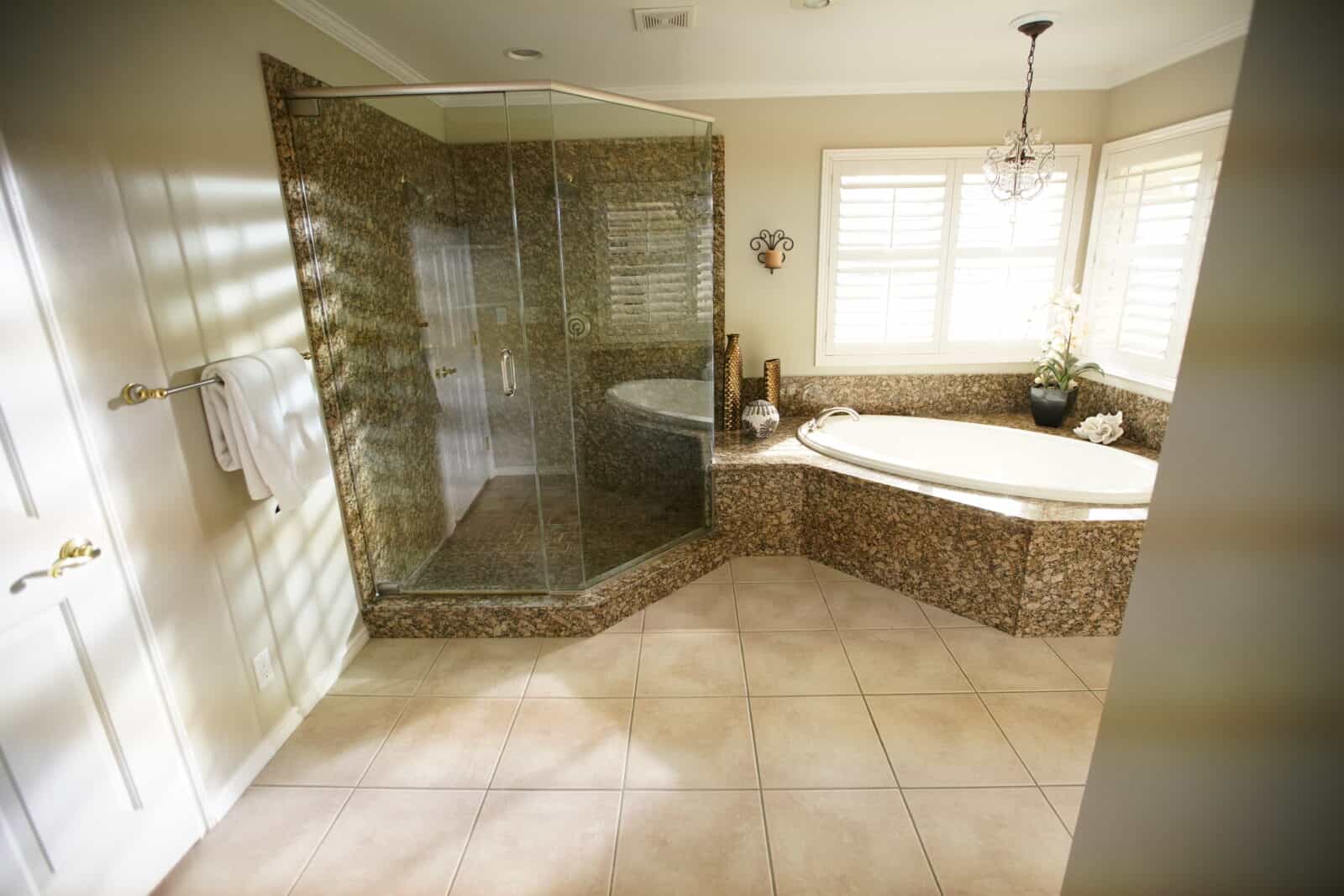
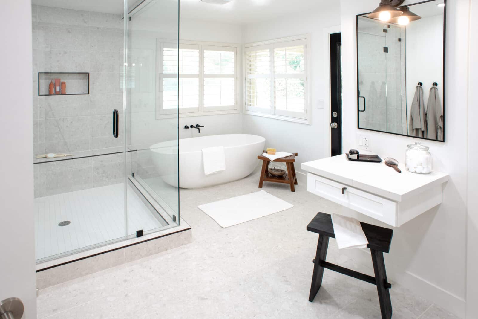
Doesn’t this bathroom just make you want to light a candle and sink into a bubble bath? By brightening up Ashley and Mike’s bathroom, expanding the standing shower, and updating the tub and fixtures, the room gets a sleek, modern upgrade. We’re also loving the way they took better use of the empty wall with a new, built-in vanity.
A Backyard Made for Barbecues
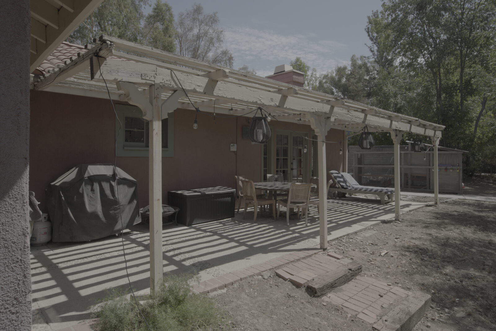
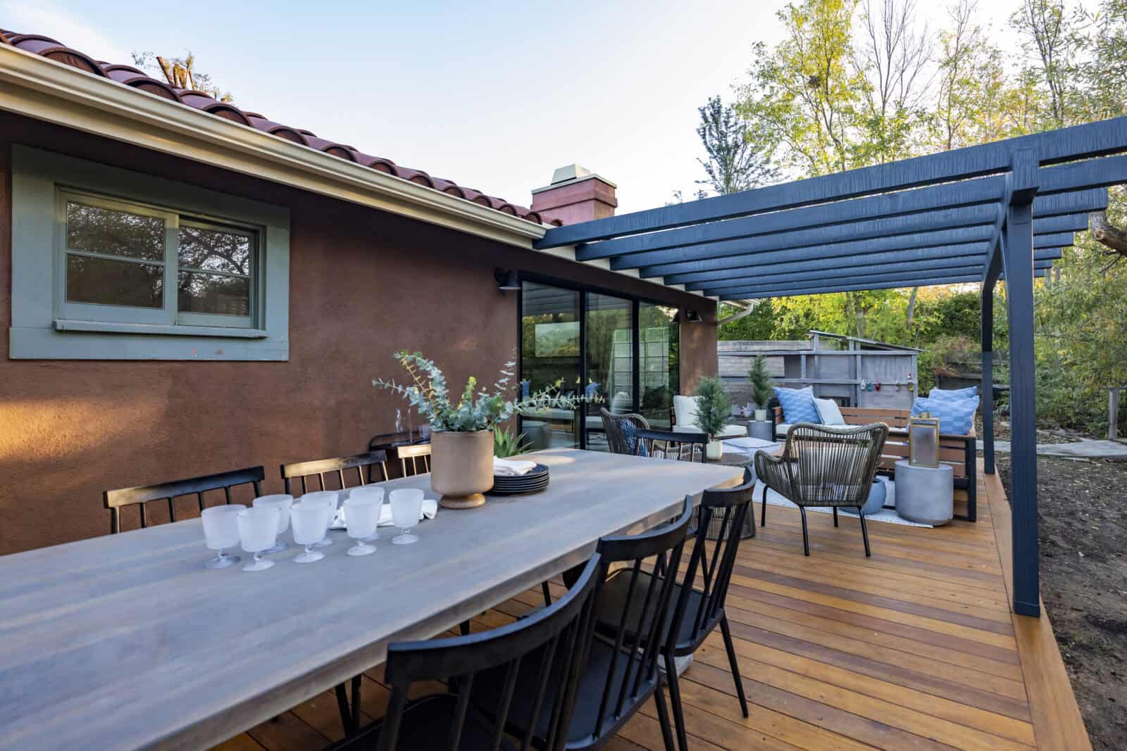
Who knew a porch could be so…dark? Drew and Jonathan really made this patio into something beautiful. They removed John and Lynn’s old patio slats on one side to bring the light in and brighten the space. On the other half of the porch, the wood slats were updated to contrast the new, warm-toned flooring and make it feel modern. A large table as well as plenty of seating for friends and family turned this patio into an outdoor oasis, perfect for barbecues and bonfires.
A Colorful Laundry Room
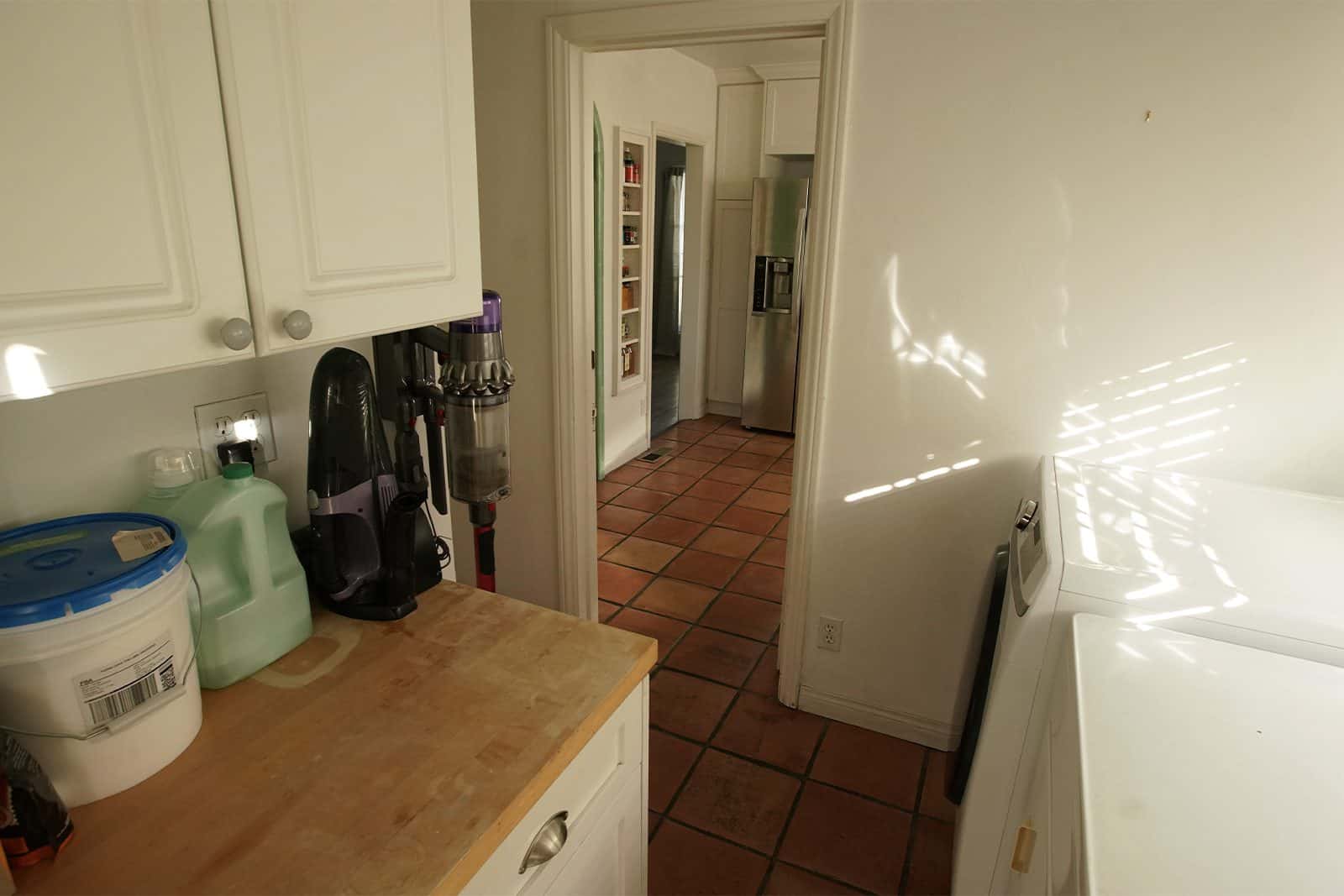
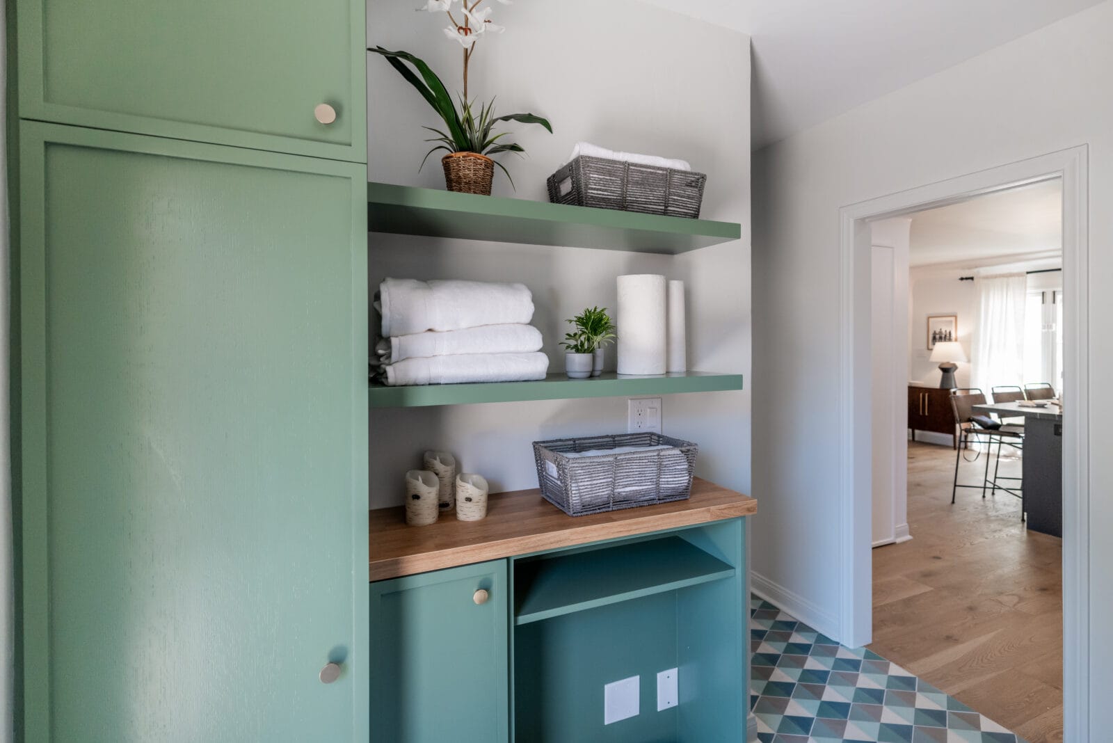
A touch of color goes a long way in a space like this. Laundry rooms can often feel outdated and boring, but Drew and Jonathan showed us that doesn’t always have to be the case. In Michele and Brian’s reno, a bit of green paint and a cool, tiled floor really make the space pop. Swapping the small cabinets for larger, more functional options and installing open shelving for linens and handy items made the space more dimensional.
A Balanced and Beautiful Bathroom
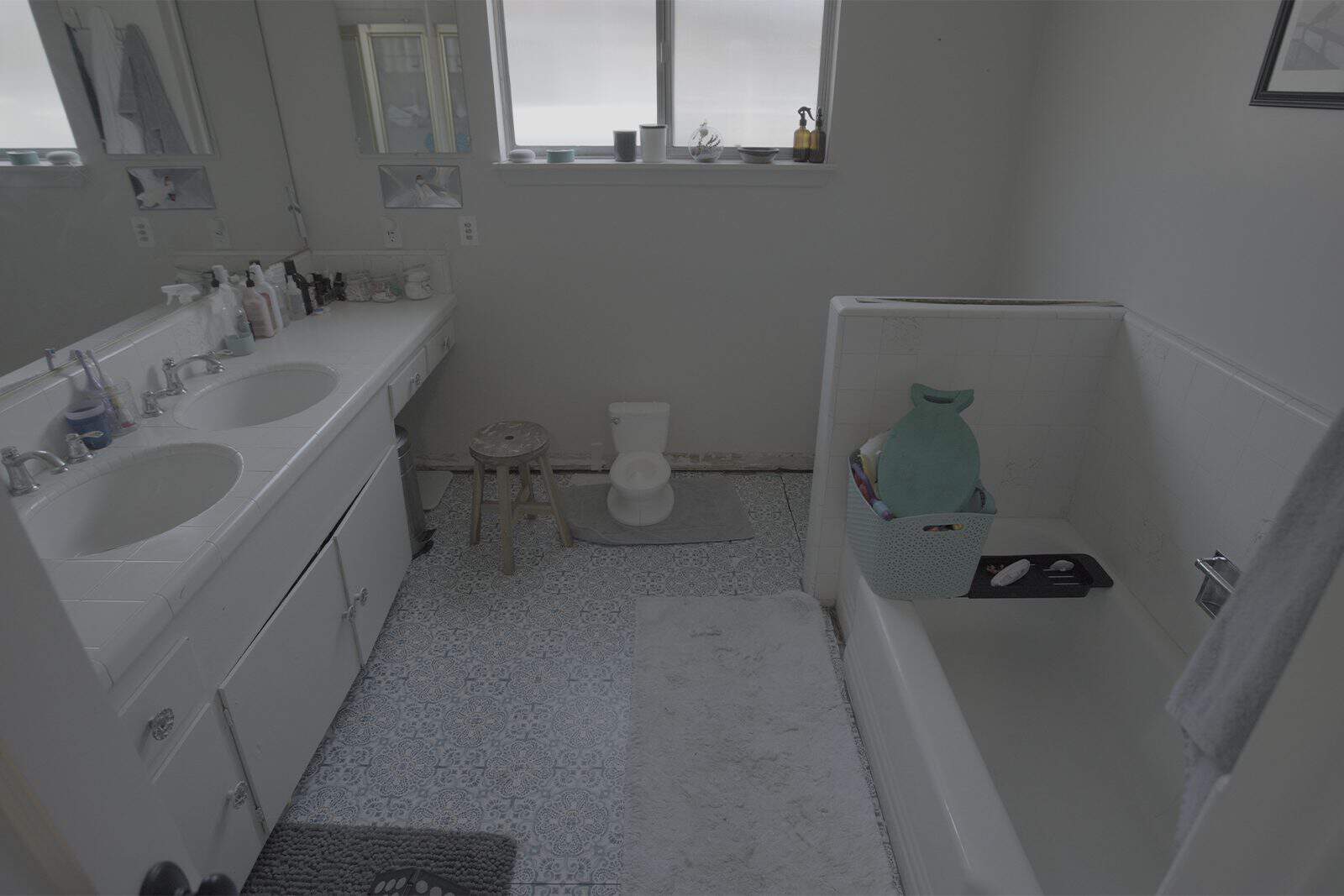
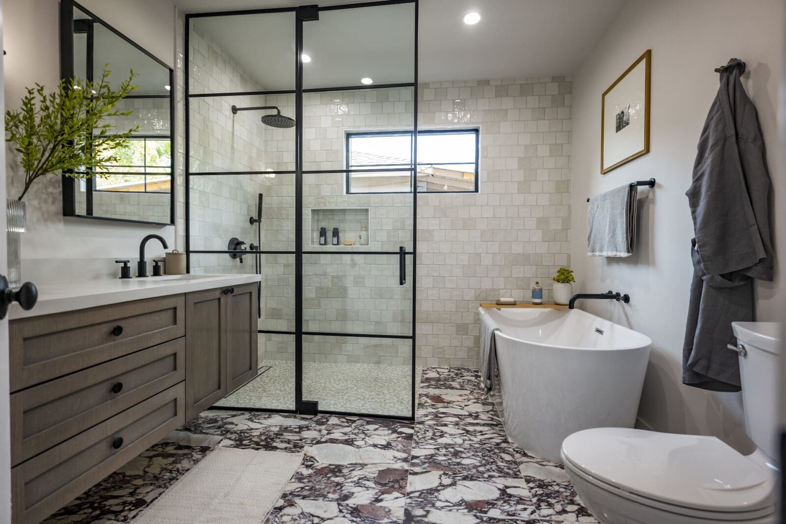
We can’t even believe is the same space! We’re absolutely blown away by the tile in Jessica and Kathy’s new bathroom. And the tub/standalone shower combination fits the vibe impeccably. Contrasting the black framing of the mirror and shower wall panel with the organic tiles and neutral colors not only makes the room more dynamic, but also creates the perfect juxtaposition between masculine and feminine features.
The Perfect Entertainer’s Lounge
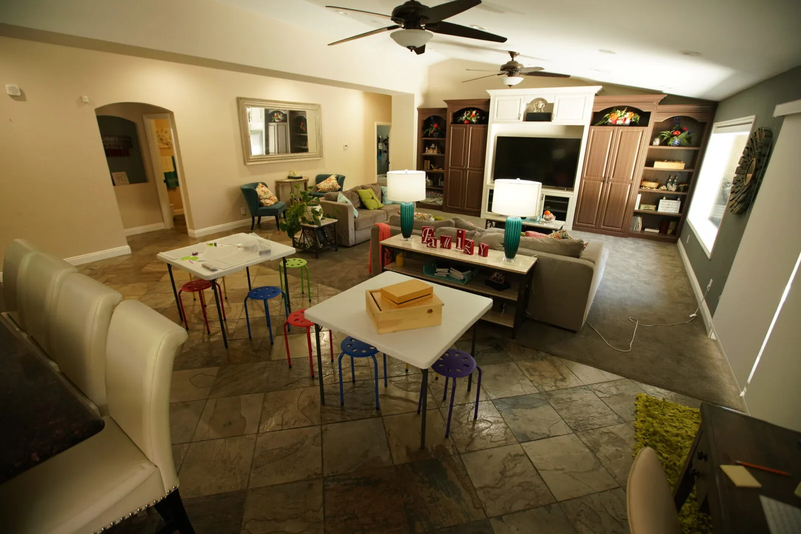
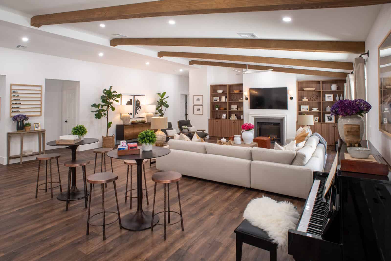
This room for Holly and Cory was transformed into the ideal entertaining space. Wood beams that match the flooring and built-in bookcases help the room feel seamless. And the use of recessed lighting throughout the space makes it easy to customize. We also love the addition of high-top tables, an upright piano, and sophisticated artwork.
A Room of Light
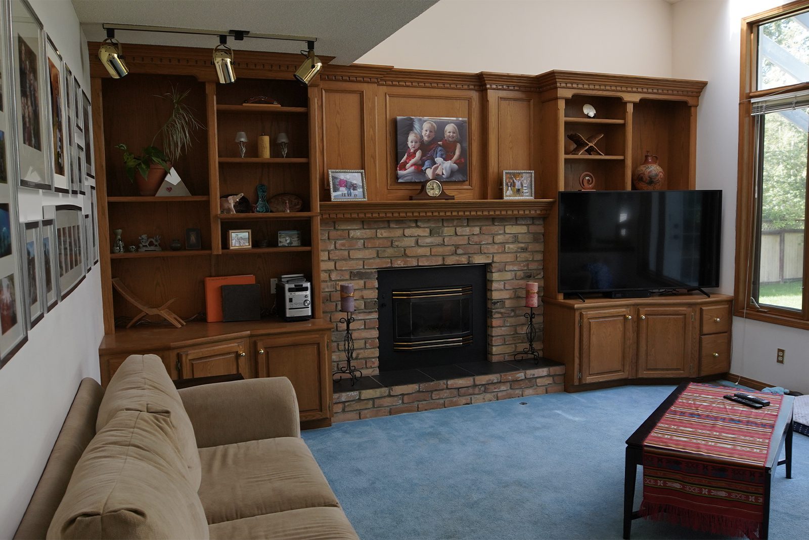
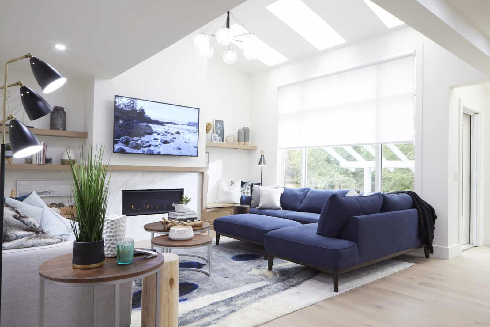
Goodbye drab blue carpet, hello bright and beautiful new living room. The Bros expanded Krista and Derek’s space here, swapping the smaller window for a large, floor-to-ceiling alternative, which gives the room an entirely new look. The fireplace and shelving were also updated with white, neutral colors to help open the room. And new sofas make the space feel so inviting.
An Organic and Organized Kitchen
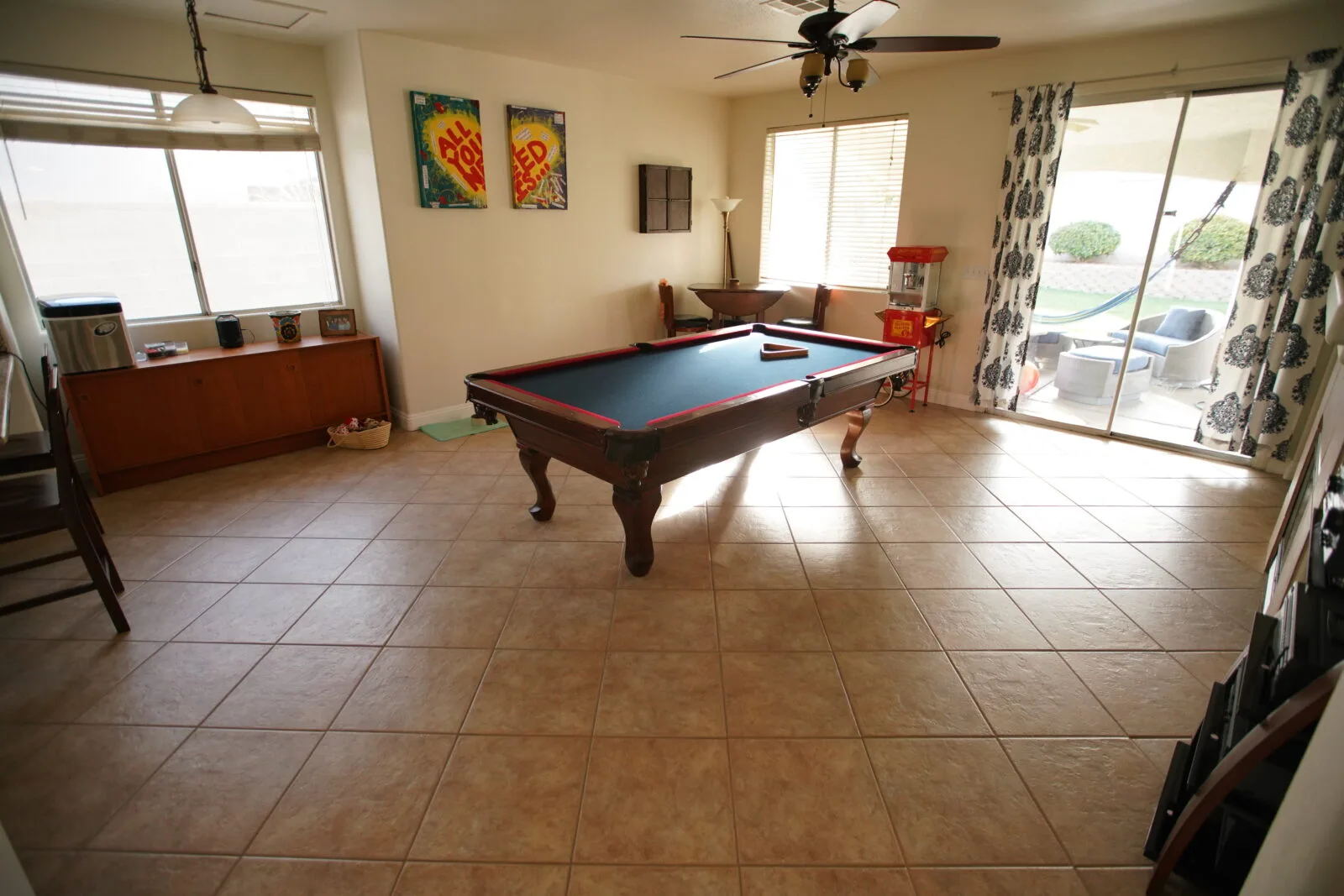
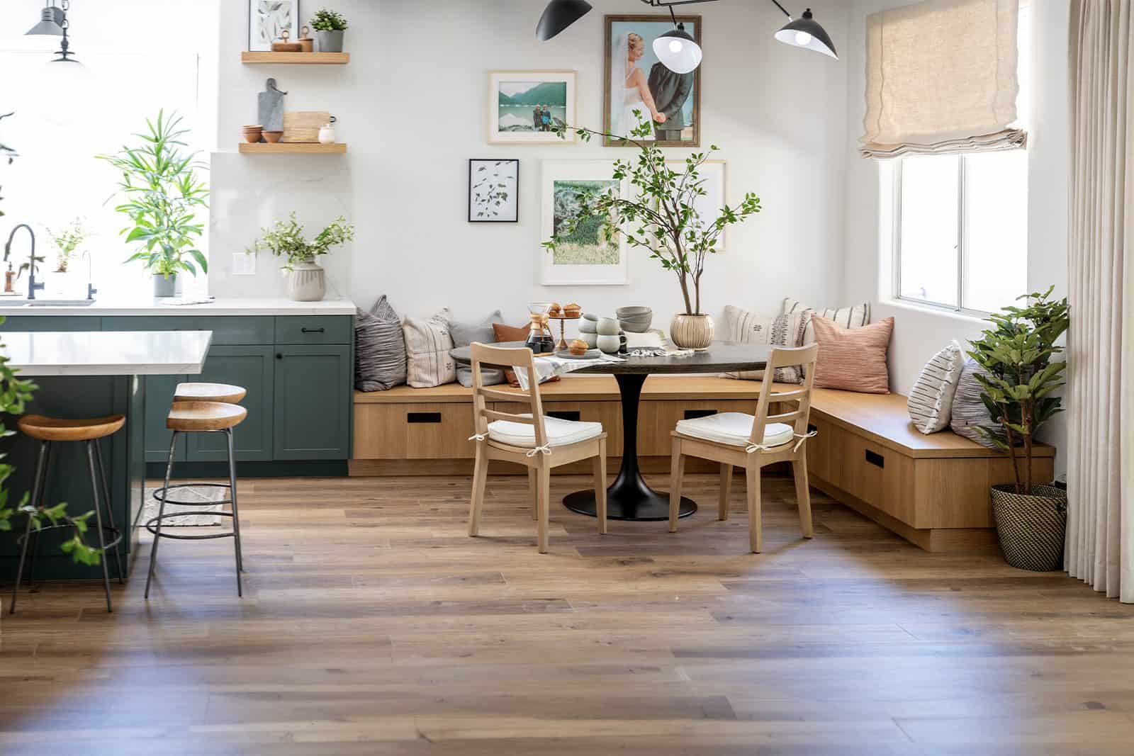
But hold on a minute…How could this be the same room? That’s what we thought to ourselves, too! This reno for Katie and Jason looks like it was made to be a fabulous kitchen with the perfect breakfast nook all along. Hardwood flooring, better use of lighting, and incorporating greenery bring a lively energy. We also love that the breakfast bench has hidden storage!
Shop Beautiful Trending Home Decor
10 Quick and Easy Home Decorating Ideas for a Fast Refresh
Need some fast, fun, and fabulous decor ideas to spruce up your space?
Read More